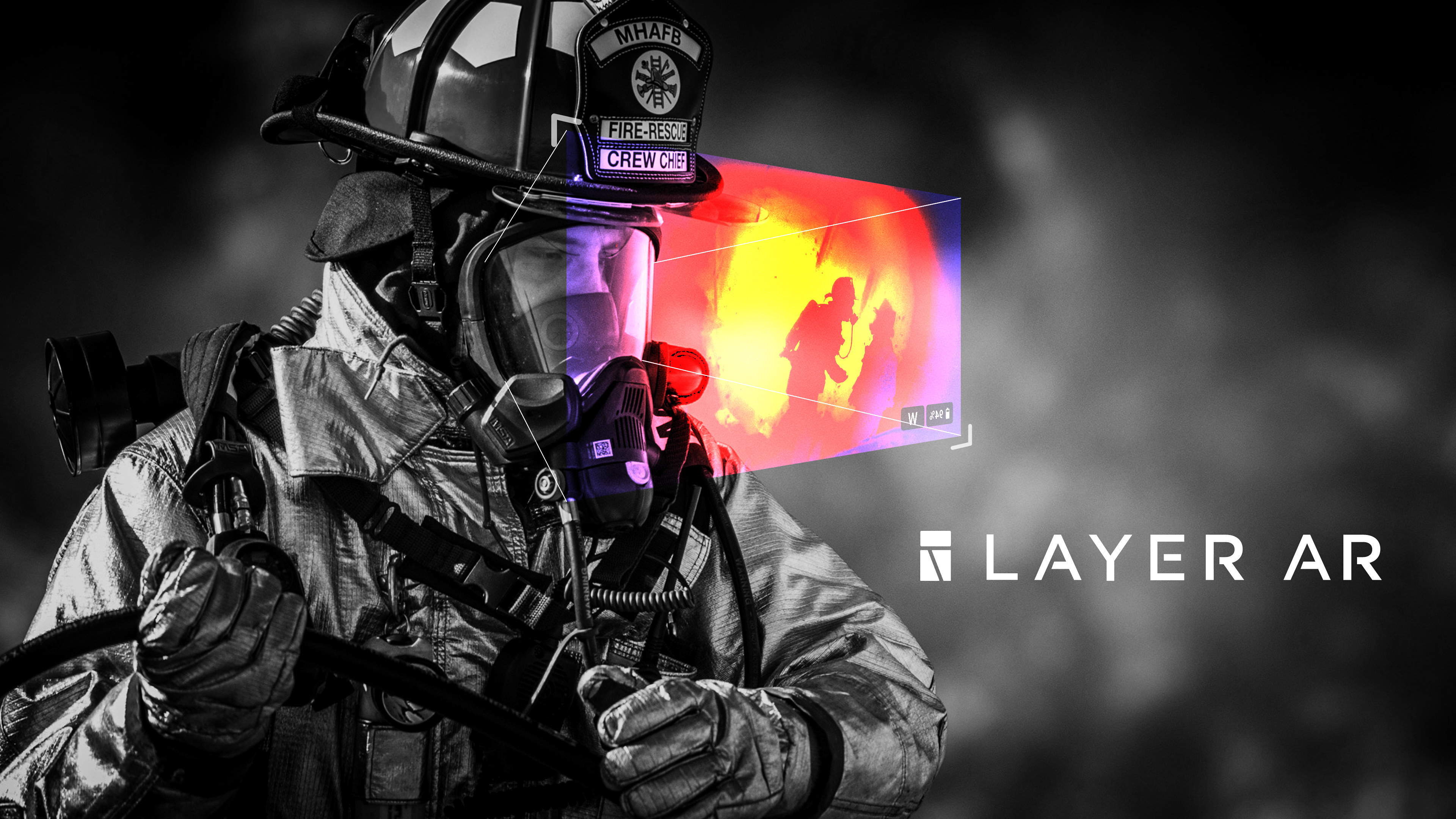
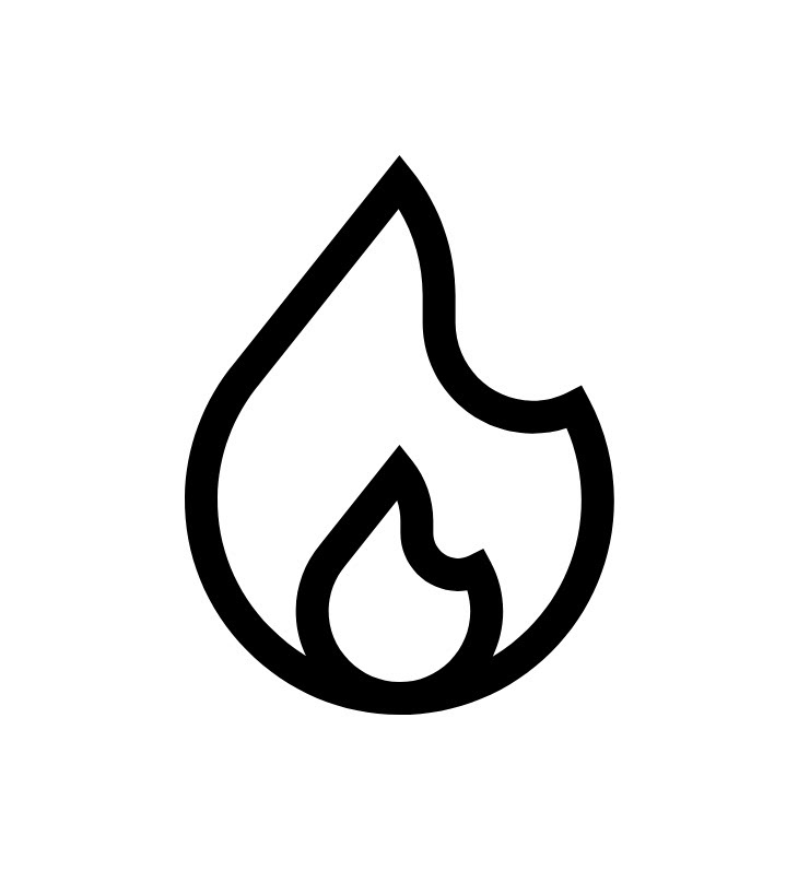
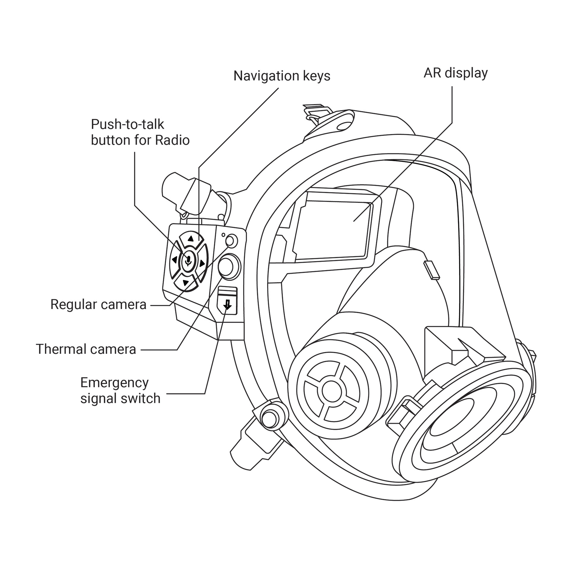
For firefighters, entering a burning structure can be especially dangerous because of a lack of vision and loss of direction by heavy smoke. Handheld thermal cameras exist to alleviate this pain point, but it prohibits firefighters from using other tools by keeping their hands occupied.
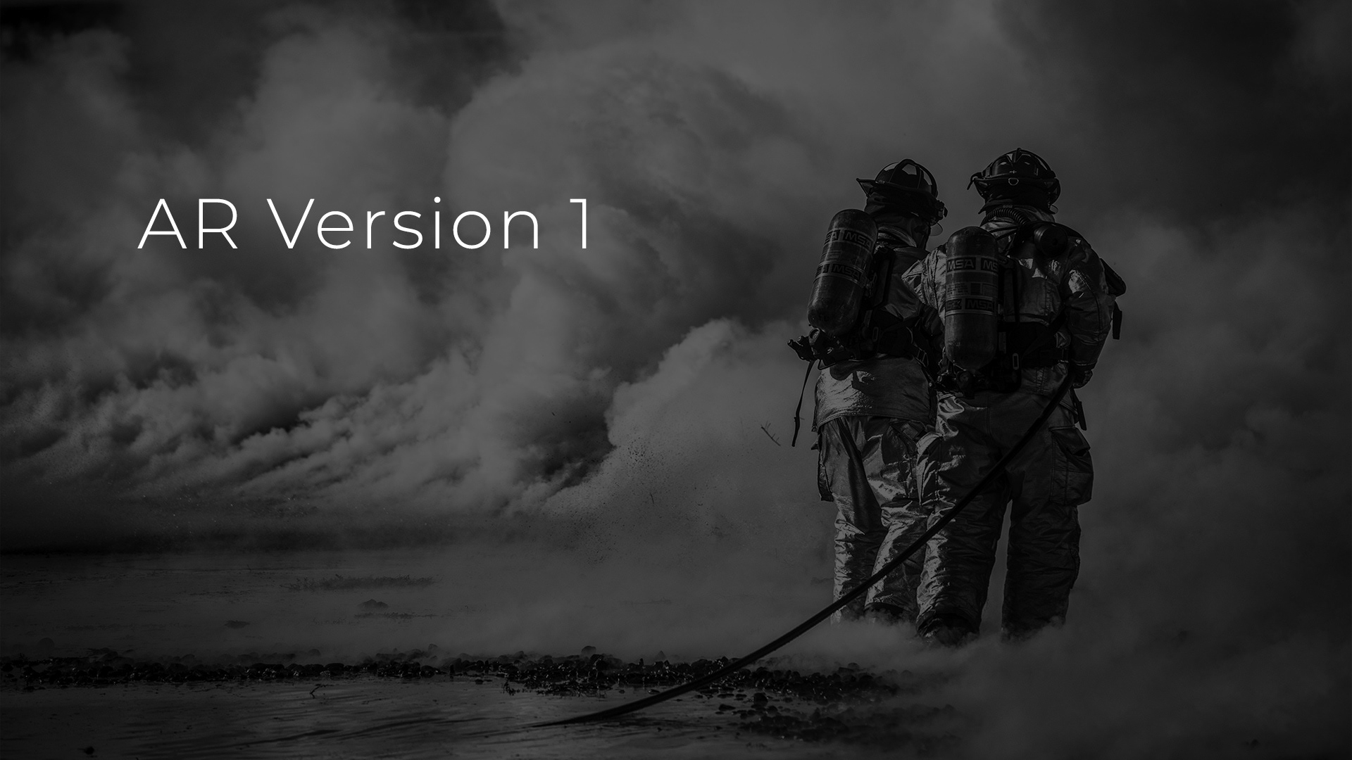
Giving firefighters the ability to view thermal imaging, direction, and additional information such as floor plans by using augmented reality can alleviate their pain points while keeping their hands free. So in 2019, I designed an Augmented Reality interface based on Google Glass platform for firefighting application.
Please watch video below for product walkthrough
Background
Throughout the internship, at Axon, I designed a police application SaaS product. I also learned that cutting edge technologies are not available for first responders and they often have to rely on outdated technologies. Fact that technologies such as (AR) augmented reality are utilized by social media for face filters but weren't benefiting firefighters to save lives bothered me.
So, after coming back from the internship in 2019, I decided to look into a way to implement AR technology for firefighting applications by working with the Auburn fire department.
Initial Research
Existing product research
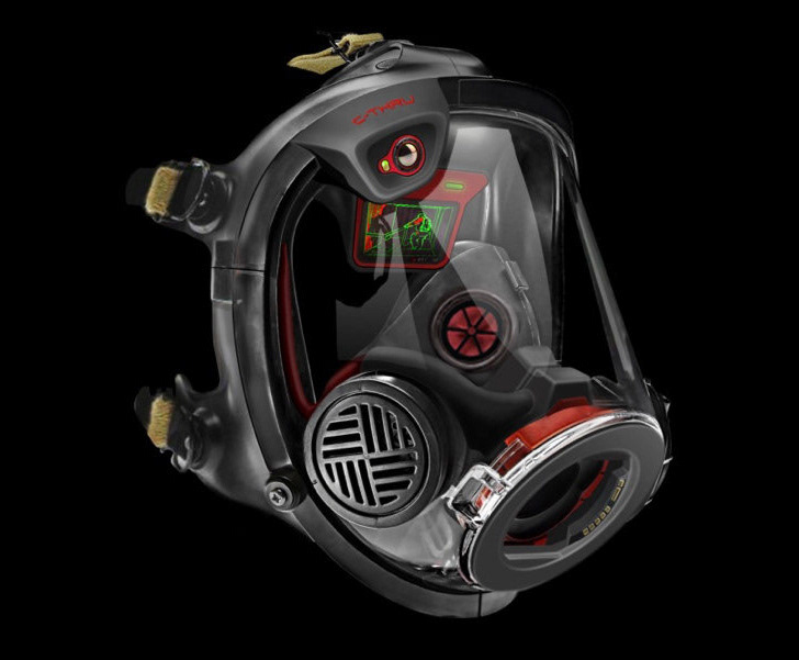
Qwake Tech's C-Thru is an AR device that displays thermal imaging processed by artificial intelligence to assist firefighters to easily navigate and locate fire or survivors in heavy smoke while keeping their hands free.
Their test proves that firefighters could navigate smoke-filled structure 267% faster with C-Thru. Also, C-Thru's cameras can be used for fire event recording and live streaming to the command center.
But C-Thru only offers thermal imaging and doesn't have other features such as displaying a floor plan, direction, or help communication with a commanding officer.
User Interview
I contacted the City of Auburn Fire department and had ride-along and interviewed local firefighter to research firefighter's workflows, needs, and pain points.
Painpoints
• When firefighters enter a burning structure, their vision gets blocked by smoke and they lose the sense of direction.
• Hotspots, such as floors or ceilings exposed to heat for a long time can collapse, because of that, firefighters carry a temperature gun to see if it is safe to take a step
• Radio communication often gets hindered by background noises such as fire alarm or because a firefighter is distracted by a task, which can be dangerous.
• Firefighter's hands are always occupied because they need multiple tools for entree and suppression.
Findings
• Fire departments have floor plans of major buildings in the city, which indicates important components such as hazards, sprinkler systems, ventilation, etc.
• During the structure fire, firefighters set up drones on each side of the building instead of relying on a single drone.
• Air masks show how much air is left in the tank with LED lights
• Firefighters uses thick gloves which prohibit the use of touch control
AR & VUI Research
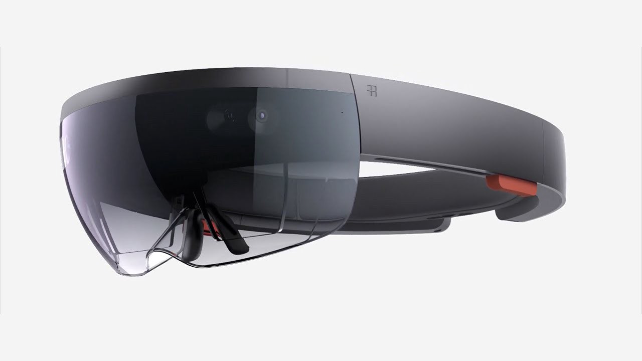
Mixed Reality platform Hololens
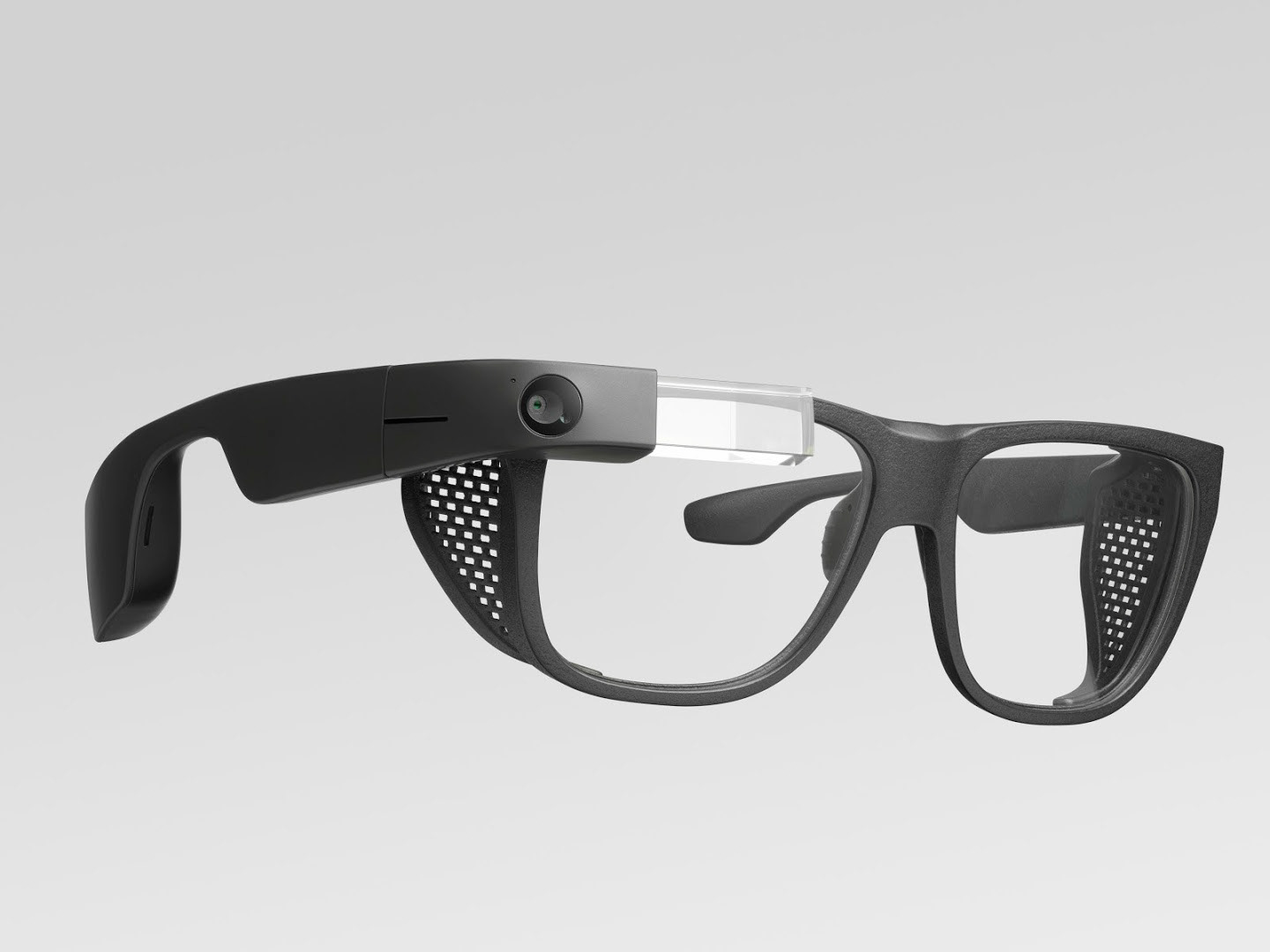
Augmented Reality platform Google Glass
Mixed Reality vs. Augmented Reality
Microsoft Hololens and Magicleap are the MR (Mixed Reality) platform capable of scanning the surroundings with lidar sensors and display virtual 3D objects in the environment. In comparison, Google Glass is an AR (Augmented Reality) platform only capable of displaying 2D images.
For this project, I chose Google Glass as a platform because:
• Google Glass takes the only portion of the user's viewing angle which allows them to pay attention to their surroundings.
• Unlike MR platforms such as Hololens and Magicleap, Google Glass requires less computing power because it only displays 2D images. This makes Google Glass's device to be more compact and lightweight, which is ideal to be integrated into an air mask. Also, firefighters don't need nor have 3D holograms to display.

Google Glass design guideline
After choosing Google Glass as a platform, I researched Google Glass UI guidelines to understand the constraints and requirements of Google Glass interface.
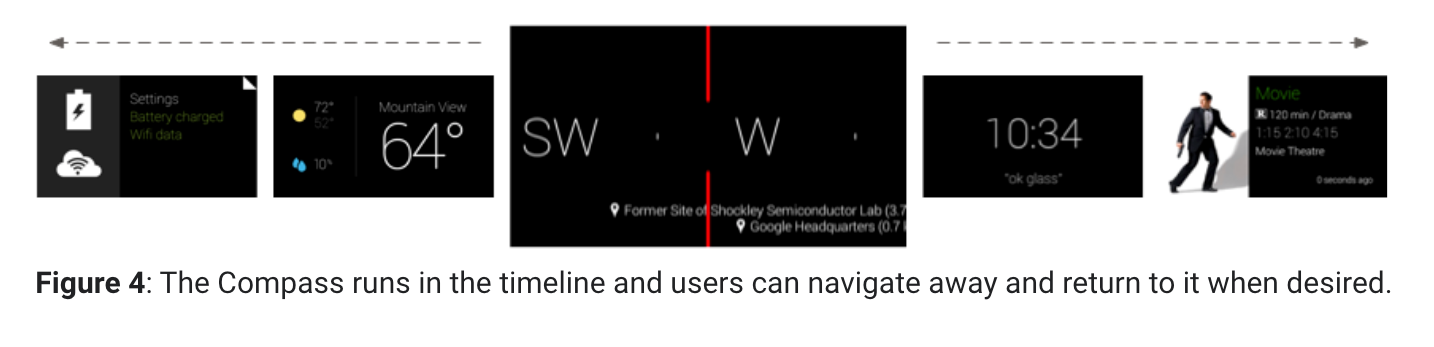
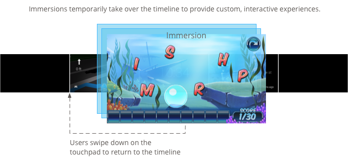
The main takeaway was that Google Glass has low resolutions and must display texts as big as it can be to maximize readability. Because of the low resolution, Google took an approach named "timeline," which separates contents into multiple pages and allows the user to easily switch back and forth between pages by using the track pad scroll. I benchmarked the "timeline" feature to accommodate the constraint of the low-resolution display.
Google Conversation Design research
User research shows firefighters wear thick gloves and their hands are occupied by tools. This prohibits the use of a touchscreen or trackpad for interaction and makes VUI (Voice User Interface) an ideal method of interaction.
I referenced Google Conversation Design guidelines and followed the recommended design process to design VUI. However, I discovered Google's conversation design is catered for consumer products and not for high-risk applications.
Google's conversation design strays away from giving tutorials to users and makes interaction more open-ended. This works well in consumer products because users won't have to listen to tutorials to interact, but it could be problematic in firefighting scenarios because firefighters will have to "guess" the phrase to interact with VUI. Failed interaction can be dangerous when it comes to high-risk applications. So, I followed basic principles but added tutorials to make VUI more suitable for the high-risk application.
AI assistant persona
After studying Google Conversation Design Guideline, I came up with an AI assistant persona as it was suggested in the guideline.
Key adjectives: Reliable, efficient, safe, professional, calm
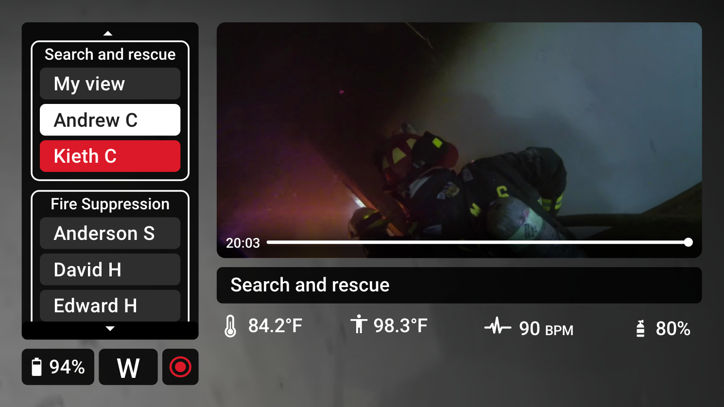
Vega is a first responder AI assistant integrated into Layer’s product. Vega’s purpose is allowing the first responders to interact with the AR interface without using trackpads or buttons to keep their hands free. Vega will keep a professional and calming tone while communicating with the user.
Constraints
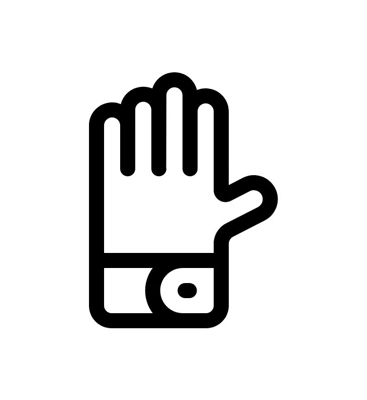
Thick gloves
Firefighters are wearing thick gloves, which prohibits the use of trackpad and touchscreen. Also, most of the time their hands are occupied because of tools they are using to accomplish a task.
High-risk application
Firefighters will be using devices in a dangerous environment while doing tasks such as suppressing fire or searching for a survivor. Because of this, the interaction must be simple and not distract them with information overload.
Display size
Since Layer's device is based on the Google Glass platform, the display only covers a portion of the user's sight. This allows users to easily view their surroundings but it also limits the screen size, which requires larger text and images.
Background noise
Fire scenes often have loud background noises coming from engines and fire alarms. This causes issues in radio communication and voice interaction. Interface should be controllable not only by voice interaction but using buttons and visually display notifications in text.
Design Process
After research, I designed the Version 1 prototype based on the user research data and as taking firefighter's and Google Glass platform's constraint into account.
Then, I refined the Version 1 prototype, which became the Version 2 prototype.
I tested the Version 2 prototype with local firefighters and designed the Version 3 prototype and tested it again to validate the design.
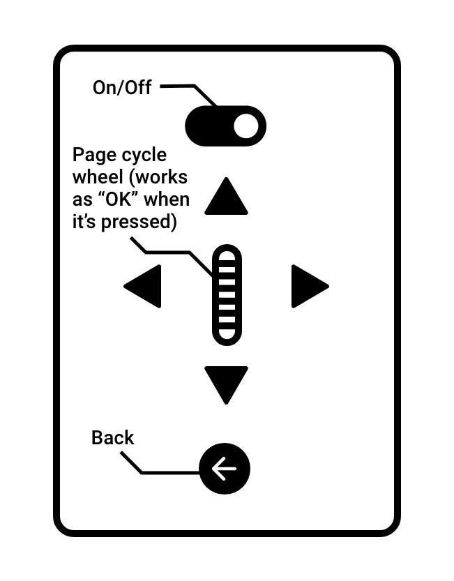
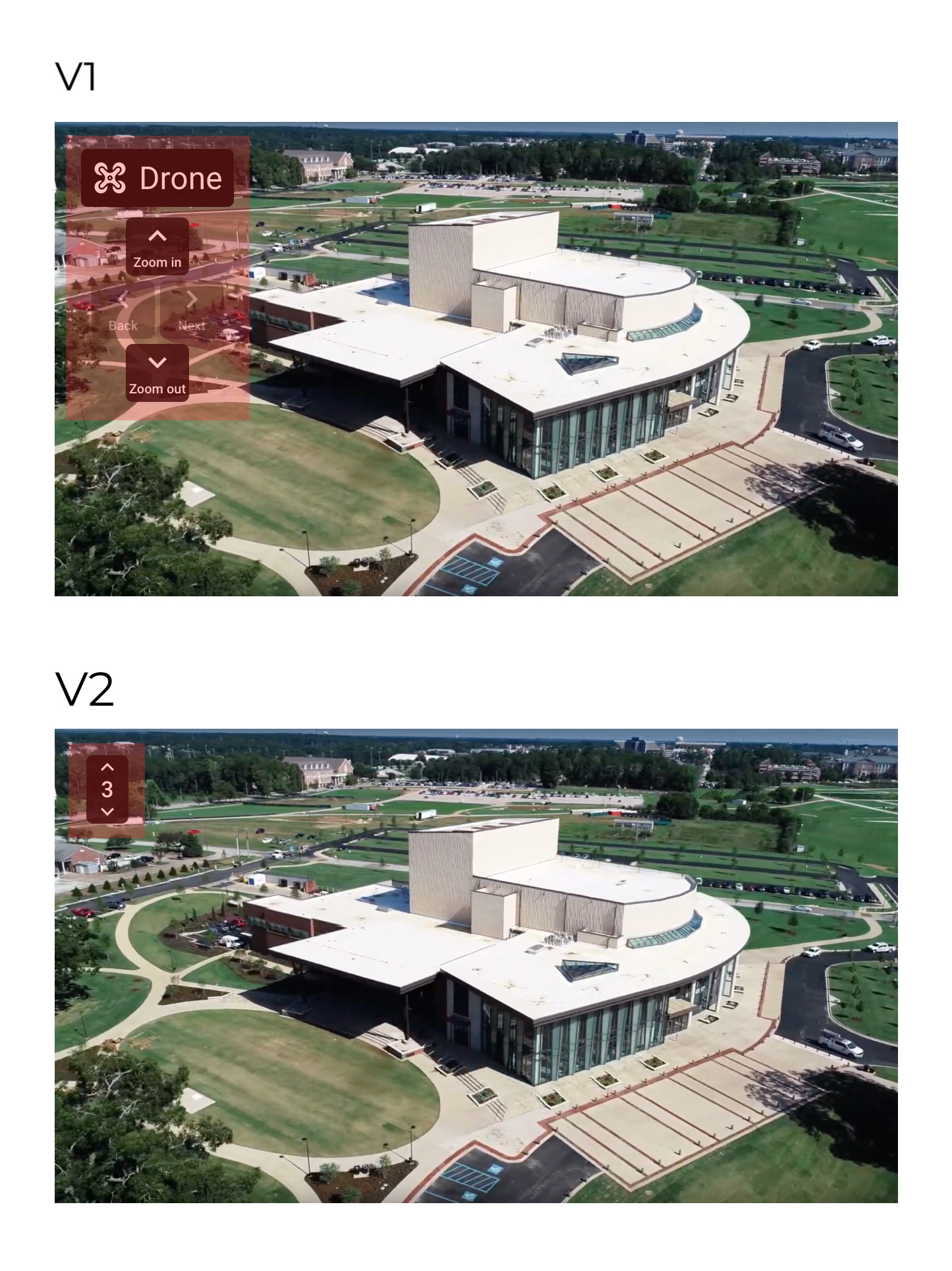
Version 1 control panel
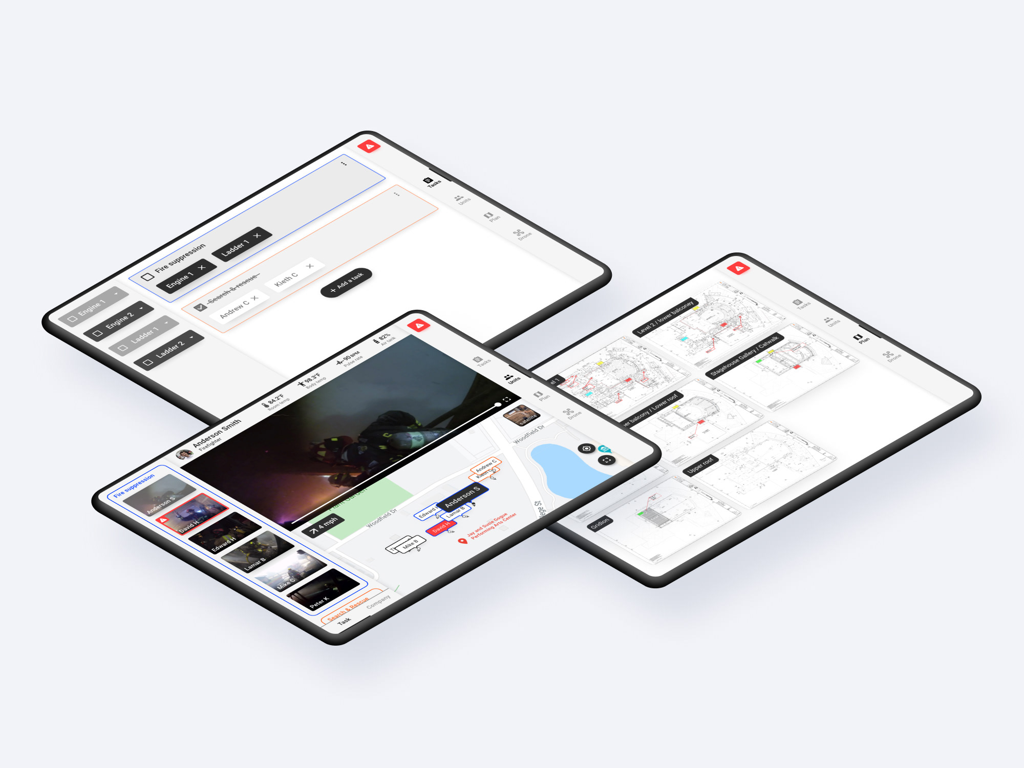
Research showed firefighter's hands are usually occupied and I included voice interaction to accommodate that constraint. But research showed that the presence of background noises such as fire alarm can interfere with voice interaction. So I added a control panel (attached on the side of the air mask) that allows firefighters to physically interact with the interface by using a scroll wheel and buttons.
In version 1, a scroll wheel was added to allow firefighters to cycle through multiple different functions quickly. Within the function, firefighters can use direction buttons and "okay" and "cancel" buttons to interact to navigate and interact.
Plan
Research showed fire departments acquire floor plans of major local buildings. Displaying such floor plans on an AR device can help firefighters to easily navigate in the building and locate important components such as gas lines and ventilation.
In version 1, users can press "left" or "right" keys to view different pages of the floor plan. Pressing "up" key once full screens the page. Then a user can use a scroll wheel to zoom in & out and use direction keys to move around. All these interactions also can be interacted with a voice command.
But this interaction was way too detailed and complicated to be used in an emergency scenario and simplified in version 2.
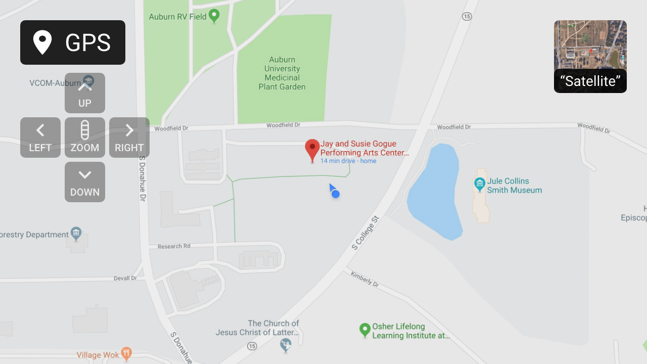
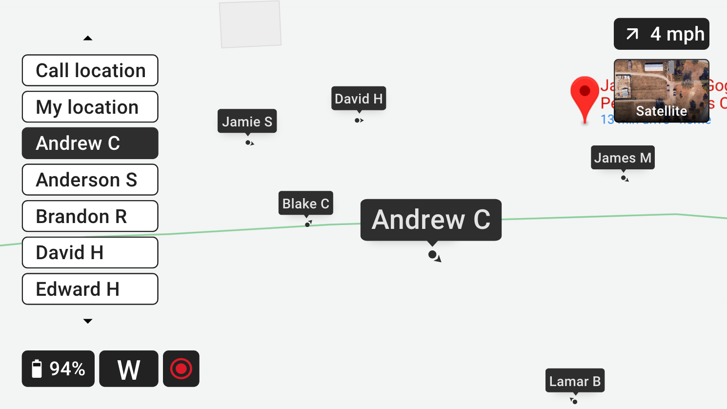
GPS
Research showed that commanding officers are often struggling to evaluate resource distribution and tell where other units are located by only relying on the radio. GPS function was designed to alleviate this pain point by displaying a user's and other unit's location on the GPS map.
Same as "plan" function, a user can move around the map by using directional buttons and zoom in & out by using a scroll wheel. All these interactions also can be done by using voice command (i.e. "zoom in" to zoom in). Finally, the user can switch to a satellite view by saying the command "satellite."
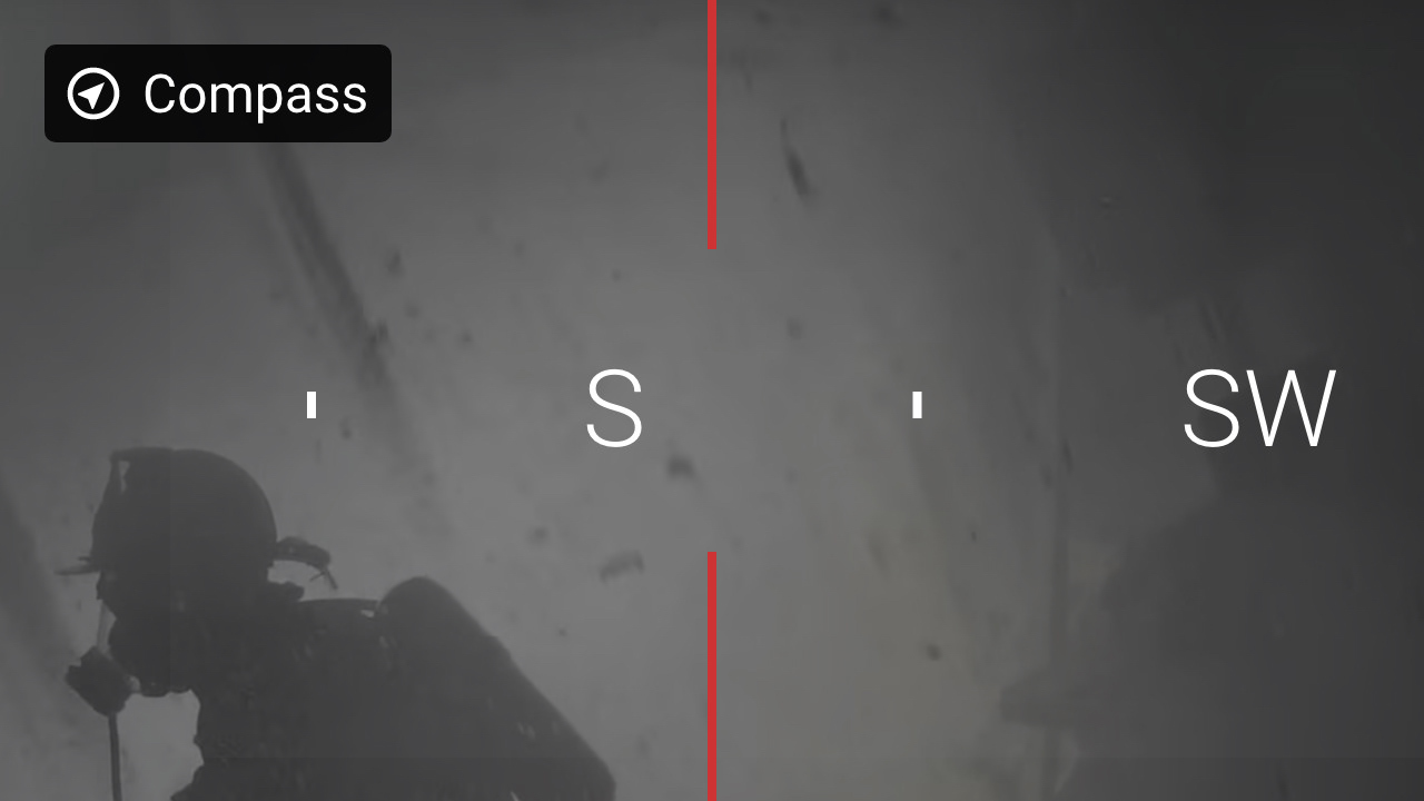
Compass
Research showed firefighters easily lose a sense of direction when losing vision due to heavy smoke. To alleviate this pain point, I added a compass function in version 1.
Later I find out that a user should be able to view compass on any page, instead of having to display it as a full screen and unable to view it while using other functions such as "plan" or "thermal."
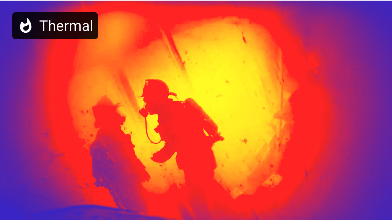
Thermal
Existing product research showed that thermal imaging is an essential function that allows firefighters to see through and navigate in the heavy smoke. Just like other functions, the thermal function can be accessed by using voice command "thermal" or by using a scroll wheel.
Stream
During the user interview, I discovered that commanding officers often struggle to evaluate units' status due to the lack of visual information since they only rely on the radio. Sometimes a firefighter may forget to respond on a radio and there is no way to tell if that firefighter is in danger or not. Additionally, providing live footage of a firefighter who is in danger may help others to locate and rescue more quickly. In short, live streaming ensures firefighter's safety.
On the "Stream" function, a user can use up and down key to cycle through the list of units to view that unit's live streaming.
Drone
At the fire scene, drones can help firefighters to evaluate resource distribution, read smoke (its color, movement, etc), and locate survivors by giving birds eyes view.
During the research, I discovered that instead of relying on a single drone, firefighters set up drones on each side of the building. Based on this finding, version 1's drone function is designed to display multiple drone's footages as thumbnails and allow a user to zoom into the selected view in full screen.
But this interaction was way too detailed and complicated to be used in an emergency scenario and simplified in version 2.
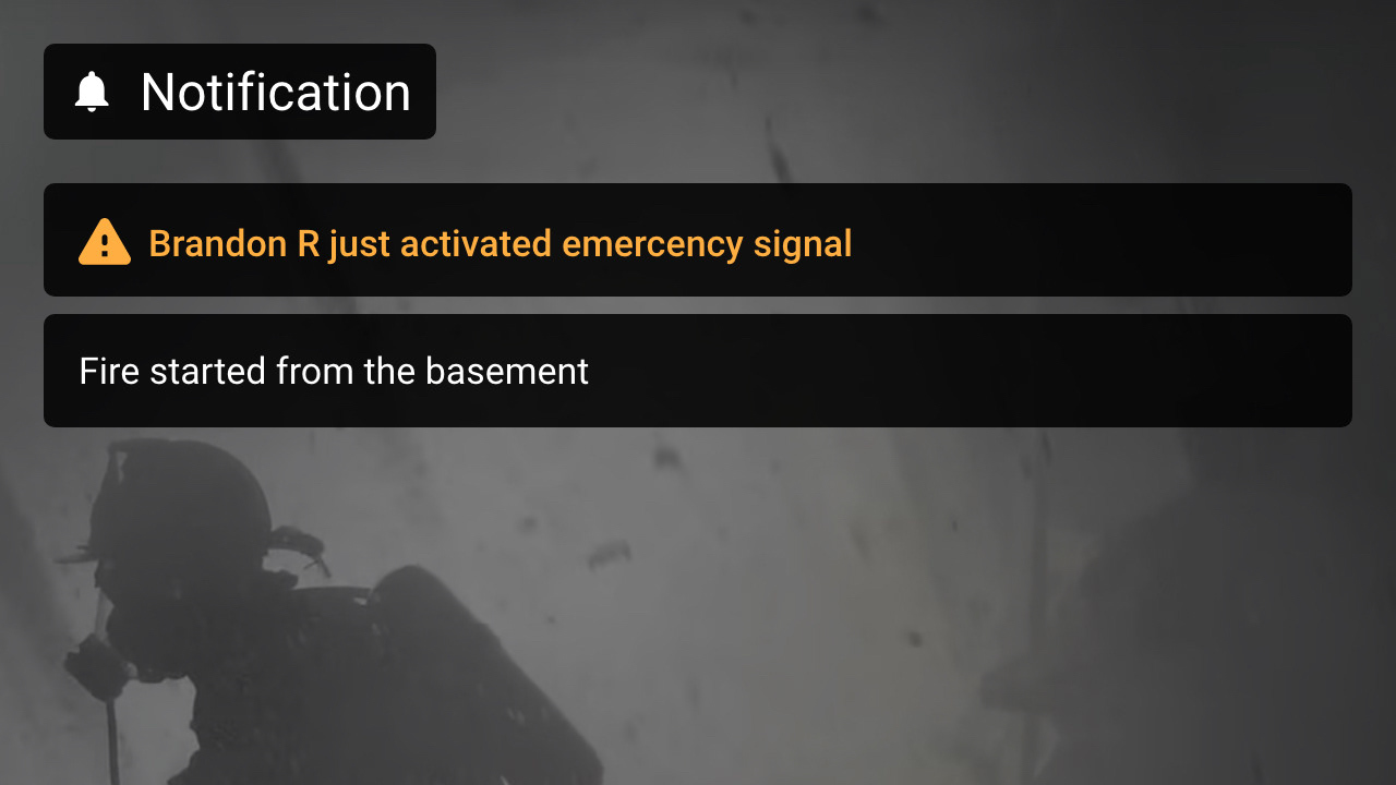
Notification
Research showed that firefighters sometimes miss radio communication because they are too caught up with a task or because of background noise. It can be dangerous if a firefighter misses communications regarding their safety (i.e. unstable structural integrity). That is why I added notification function so firefighters can audibly and visually receive updates from commanders.
In version 1, I made a separate notification function page where a user can view previously received notifications. But soon I learned that having more function screens to cycle through slows down a user from reaching the screen they need to view. So this notification screen was removed on version 2 and displayed only the most recently received notification on the footer area.
Status
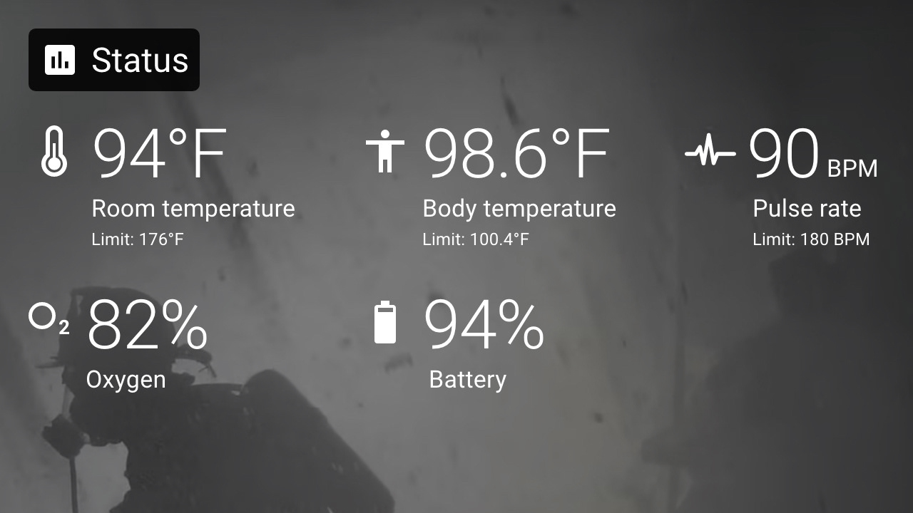
The status function displays a user's biometric statuses such as pulse rate and room/body temperature and resource statuses such as air tank and device battery level.
In version 2, this function became merged with the "stream" function to reduce the number of functions that the user has to cycle through and also to allow a user to view other unit's status.
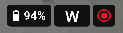
Footer area
Google Glass guideline had a dedicated screen real estate at the bottom of the screen for purposes such as displaying a notification snack bar. So, I added a footer area at the bottom of the screen to benchmark Google Glass's interface guideline. The Footer area displays information such as the streaming indication icon and notification snack bars. Also in version 3, compass function merges into the footer area to be visible at all screens.
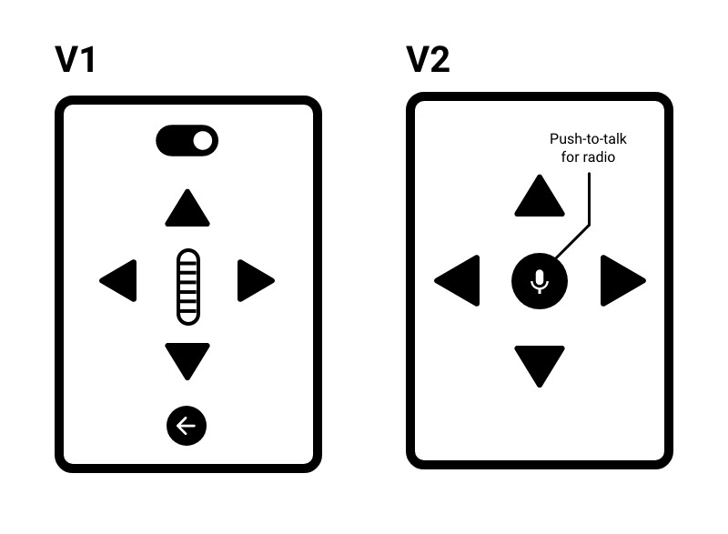
Version 2 control panel
When I designed a version 1, I was too focused on granting as many useful functions to users and allowing detailed controls. This resulted in a complicated interface that is unsuitable for emergency scenarios. So I revised the design to be simpler to make it easily and quickly interactable in emergency scenarios.
On version 2's control panel, I cut down the number of buttons to 70% and removed a scroll wheel because dust and sands could get stuck. The number of function screens is cut down from 8 to 5. Reducing it lowers the time it takes a user to cycle through the functions and having fewer screens reduces a user's cognitive load.
How control panel works
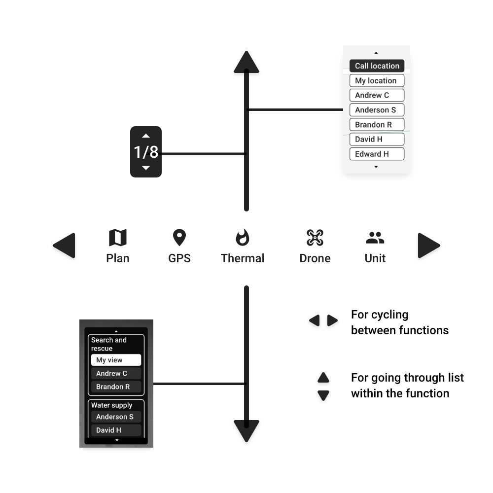
A user can cycle between different functions (i.e. plan, thermal, etc) by using "left" and "right" keys.
Within the function, a user can use "up" and "down" keys to go through the list (i.e. changing floors in the "plan" function and going through a list of units in "GPS" function).
Screen real estate
Since Google Glass has limited screen resolution, allocating screen real-estate efficiently was an important challenge throughout the project. By only displaying essential texts on the screen, version 2's UI elements take 75% less screen real-estate so a portion of map or video won't be covered up by UI elements.
Basic tutorial
Unlike smartphone apps, Layer AR is a Google Glass platform based interface without conventional touchscreen interaction, and using buttons to interact with software can be counter-intuitive.
To solve this problem, on version 2, I added a short onboarding tutorial to teach users how to interact with the software by using voice command and buttons.
Plan
Version 1's plan function was designed to allow a user to zoom in&out and move around when zoomed by using a scroll wheel and buttons. But on version 2, since the scroll wheel is removed and the number of buttons is reduced, software interaction had to be simplified to accommodate the hardware change.
On version 2, users can cycle through floors by using "up" and "down" buttons. Detailed interactions such as zooming are replaced with voice commands. By simplifying the interaction, the interface is now more suitable for emergency scenarios and requires less training time.
GPS
On version 2 of the GPS function, I added a list of units to allow a user to quickly locate a unit on the map instead of having to move the map around. A user can go through the list by using "up" and "down" buttons. A user can also use the voice command "locate (name)" to locate that unit on the map.
In addition, on version 2, I integrated the compass function into the GPS function screen. Now the direction a user is facing is displayed in "N, NW, W, SW, S, SE, E, NE" similar to a car's room mirror. This reduces the number of functions a user has to cycle through which allows faster interaction and gives less cognitive load to a user.
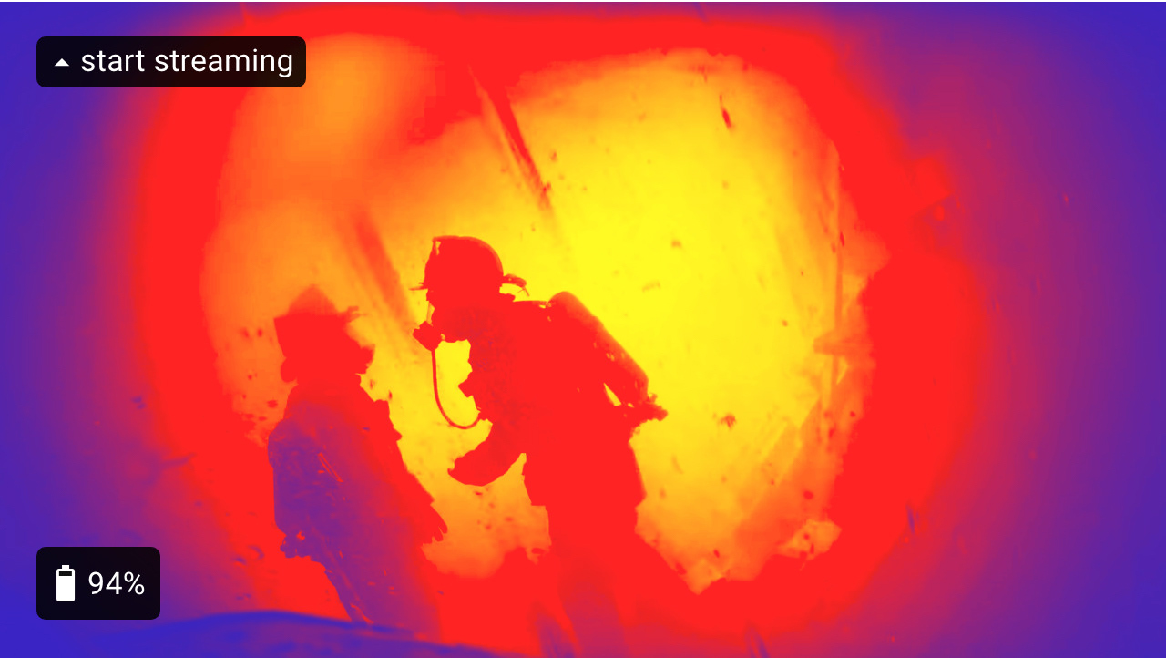
Thermal
Version 2's thermal function is identical from version 1. But since the "stream" function of version 1 is now merged with the "unit" function page, now a user can press the "up" button on a thermal function page to start streaming.
Drone
Version 1 was designed to display multiple drone footages in a single screen as thumbnails and zoom in to view it as a full screen. This interaction was unsuitable for emergency scenarios because a user had to push buttons multiple times to fully screen the footage they would like to view and Google Glass's limited resolution makes thumbnail size video unviewable.
In version 2, I simplified the interaction by displaying single drone footage as a full screen as a default. A user can cycle through different drone footages by using "up" and "down" buttons, which is similar to the "plan" function. This simplifies the interaction and reduces the cognitive load on a user.
Unit
On version 2, "status" and "stream" function pages are merged into the "Unit" function page. Unit function page display's a user's own and other unit's live streaming, and status such as heart rate, and assigned task to allow a user to gain more overview on his/her crew members. A user can go through the list of units by using "up" and "down" buttons or use the voice command "show (name)'s status" to view that unit's live streaming and status.
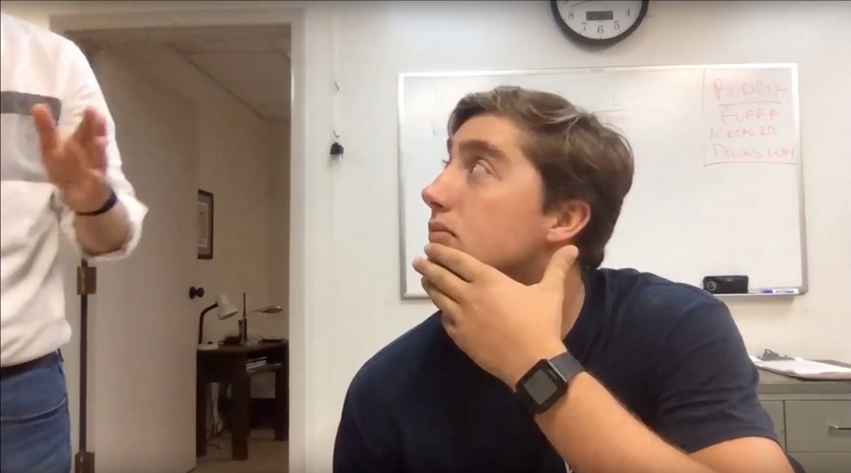
Version 2 User Test
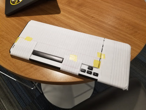
After designing the version 2 prototype, I conducted user tests with three local firefighters. I used a modified keyboard (image on left) to mimic the experience of five buttons panel attached to the air mask. The prototype was created with Adobe XD to simulate and test voice interaction.
Main findings
1. First and second test firefighters skimmed through "Basic tutorial" and struggled to accomplish some of the tasks given at the early phase of testing. but eventually, they became familiarized and intuitively figured out how the interface cycles with directional buttons.
2. The majority of test firefighters used a voice command to complete given tasks instead of using physical buttons. This could show voice commands are even more intuitive use than buttons on the panel (or maybe they did it that way just because it felt cool).
3. "O2 icon" on the "Units" page was understood as blood oxygen saturation during all three tests when meant air tank level. Because of this, I changed the "O2 icon" to the "air tank icon" on version 3.
4. The overall test went smoothly and proved that the version 2 interface was intuitive to use even with very little training.
Version 3 control panel
The control panel button layout of version 3 is identical to version 2. On version 3, buttons became larger to allow firefighters to easily press while wearing thick gloves and the emergency toggle button (for sending out a distress signal) is added. The emergency toggle button is placed on the front side of the panel module to prevent a user from accidentally flipping it while pressing buttons.
Basic tutorial
The basic tutorial was updated to explain the newly added feature and teach voice command interaction in more detail.
Function indicator
In version 2, I added a function indicator, which briefly displays when a user press the "left" or "right" key to cycle to a different function. The function indicator displays available functions and highlights the function that a user is currently on.
Plan
While testing version 2 prototype, I discovered that 2 out of 3 firefighters struggled to tell which floor they are currently looking at on the "plan" function page. Based on this finding, on version 3 I made a "plan" function to briefly display the name of the floor in a large text when a user cycles to the next or previous floor page using the "up" or "down" button.
Also, the number indicator on the top right corner of the version 2 screen (UI that displayed 1/8, 2/8...) is now replaced with Instagram-like circle indicators on the left side of the screen.
GPS
During the version 2 test, one of the firefighters pointed out that it would be useful if he could view the wind's direction and speed to tell how fire is behaving. Based on this finding, I added wind direction and speed information UI on the "GPS" function page on version 3.
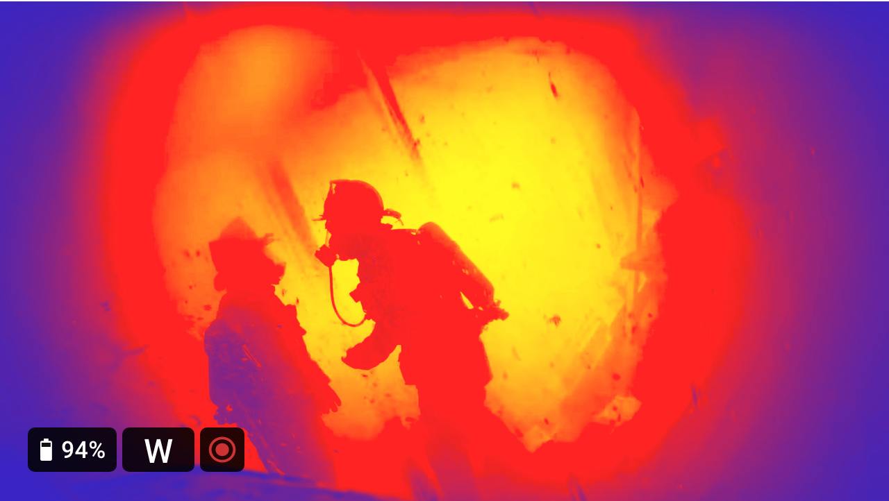
Thermal
Version 3's Thermal function screen is the same as version 2's. But on version 3, a user can start streaming on any function page with the voice command by saying "start streaming."
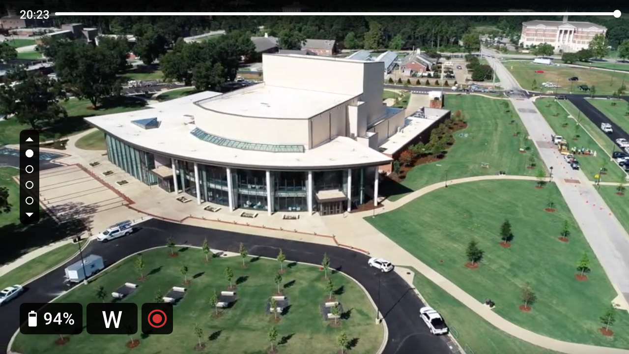
Drone
On version 3 of the "drone" function screen, similar to version 3's "plan" function, I replaced the number indicator with an Instagram-like circle indicator. Additionally, on version 3 I added a feature that allows a user to view previous footages by using the voice command "Go back (seconds)."
Units
While testing the version 2 prototype, I discovered that The "O2 icon" came across as blood oxygen saturation during all three tests when it meant air tank level. So on version 3, I replaced the "O2 icon" with an "air-tank icon" to remove the confusion.
Also, similar to version 3's "drone" function, a user can go back in time on live streaming to view what previously happened by using voice commands.
Always visible compass
While testing the version 2 prototype, I discovered that firefighters were struggling to tell which direction they are looking at when they pulled up the "plan" function page. Then it became obvious that firefighters should be able to tell which direction they are facing all the time, not only when the "GPS" function is pulled up. So, on version 3, the compass is moved to the footer area to always show which direction a user is facing on any page.
Version 3 User Test
Version 3 prototype user test was conducted with three local firefighters by using the same setup from version 2 prototype.
Main findings
1. Despite version 3 prototype displays floor name in the large text when a user cycles pages on "plan" function, the first tester still couldn't tell which floor he was looking at. Maybe the interface should instruct how the "plan" function works while on-boarding.
2. 2 out of 3 testers found the feature that allows them to go back in time on the live stream useful.
3. The test proved that the product is intuitive enough to be used with very little training.
Conclusion & Takeaways
Firefighter's feedbacks were positive throughout the version 3 user test. Participant firefighters interacted with the software smoothly and were impressed by the product's possibility. So I finalized the design and made a product intro video below.
But when I posted the product video a few months later on r/firefighting for online firefighter community's feedback, feedbacks were mostly negative.
These were three main concerns:
1. Buttons are still too small to be pressed while wearing thick gloves. The number of buttons should be reduced to one or two.
2. The system displays too much information. floor plan and thermal imaging can be useful but there is no point in viewing drone footage while in a burning building.
3. Voice interaction cannot be trusted in emergency scenarios
To address the first concern, maybe instead of putting buttons on the panel, I should have put a single big and flat joystick similar to the ones that can be found on videogame controllers. Having a joystick instead of buttons could have allowed even easier interaction while wearing thick gloves.
To address the second concern, the "settings" feature can be added to allow a user to turn on only the functions they would like to use to be enabled. Commanding officers may want to be able to view drone footages to gain an overview of resource distribution but other firefighters may not need such information and it may just hinder their interaction.
The third concern was already solved issue because a user can interact without voice interaction by using the control panel. But that may have not been conveyed clearly in the video.
In conclusion, I learned that relying on a smaller pool of users for feedback can create an unforeseen problem down the road. Having four small buttons instead of a single joystick would have been a massive problem if this was a real product since hardware cannot be updated like software. Also, I gained a great deal of design experience by pushing my design skill to the limit by challenging myself to come up with solutions around the multiple user and hardware constraints caused by a unique user group and hardware platform.