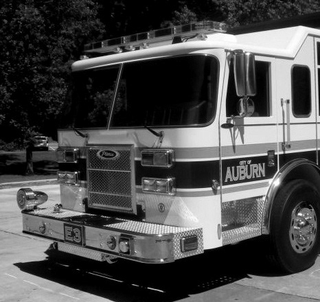
Commanding officers such as fire captain and battalion chief are in charge of the commanding firefighters at the fire scene. But despite technological progress, commanding officers still have to solely rely on radios to communicate with their units. They have to allocate limited resources but there is no way for them to visually evaluate resource distribution. Also, the radio's lack of visual information makes it difficult for them to quickly evaluate the situation.
So I designed tablet-based unit management software that allows commanding officers to evaluate the situation by visualizing resource distribution and sync with units' AR devices to view the unit's live stream.
Please watch video below for product walkthrough
Background
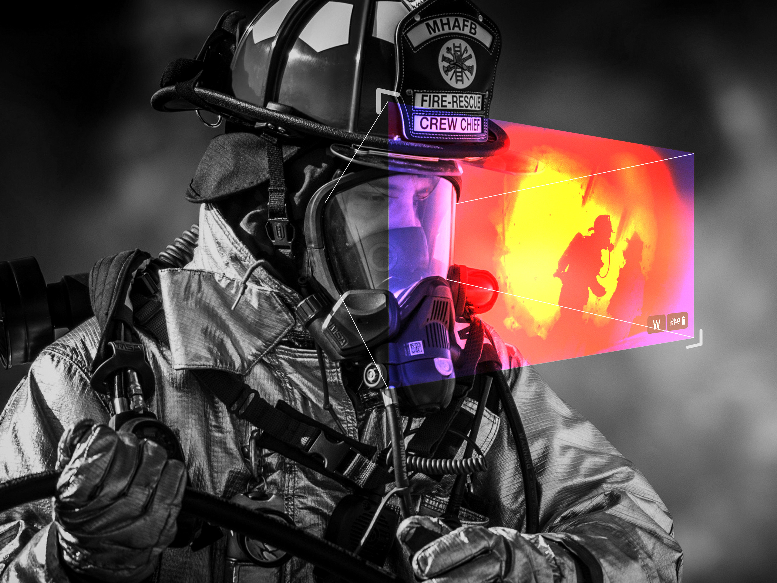
Throughout the internship, at Axon, I designed a police application SaaS product. I also learned that cutting edge technologies are not available for first responders and they often have to rely on outdated technologies. Fact that technologies such as (AR) augmented reality are utilized by social media for face filters but weren't benefiting firefighters to save lives bothered me.
So, after coming back from the internship in 2019, I decided to look into a way to implement AR technology for firefighting applications by working with the Auburn fire department. This page showcases the design process of accompanying tablet software designed for commanding officers.
Research
At the beginning of the project, I contacted the City of Auburn Fire Department to conduct qualitative research. I interviewed Auburn Fire Department Chief and commanding officers to learn about commanding officer's workflows, needs, and pain points.
Findings
• During the first interview I learned how different ranks such as firefighters, officers, and battalion chief have different tasks and goals. Unlike firefighters, incident commanders only present at the larger fire scene, and instead of entering the building, they overview the situation from the outside and allocate resources and units. Based on this finding, I figured there needs to be a separate software from the AR interface designed to assist incident commanders.
• During the interview, I discovered that commanding officers' pain point is the inability to gain an overview of resource distribution because they solely rely on radio to command their units. This means commanding officers need to keep track of who is assigned on which task in their mind. Also, relying on the radio at the large scale fire scene to assign units can take up to 5 minutes.
• Drones are not only helpful in reading fire's movements but it also give a visual overview of where trucks are parked and how resources are distributed. This can be helpful because commanding officers need to allocate limited resources most efficiently.
Constraints
Multitasking
when a commanding officer arrives at the fire scene, they have to plan the entree, allocate resources, and assign units to tasks. Afterward, a commanding officer needs to gain an overview of the scene and units' status via multiple sources from radio, drone footage, and unit's live streaming. Because of this, the system should be designed to allow easy multitasking and display multiple pieces of information in an organized way.

Communication
Solely relying on radios to communicate with units creates several pain points. Commanding officers have to keep track of which unit is assigned on which task in their head. Sometimes, a unit may miss the radio call and commanding officers can't communicate with that unit. Missing radio communication can be dangerous when a commanding officer orders units need to pull out of the building because of unstable structure. The system should be designed to allow easy and reliable communication between commanding officers and units.

User demographic
The demographic of commanding officers are in their late '30s to early '50s which means they are likely not comfortable with interacting with touch screen interfaces. Also, during the interview, I discovered that commanding officers dislike typing on a touchscreen and prefer using radio because it takes them longer to use a keyboard. Because of this, the system should be designed to be intuitive and avoid input fields that require typing.
Design Process
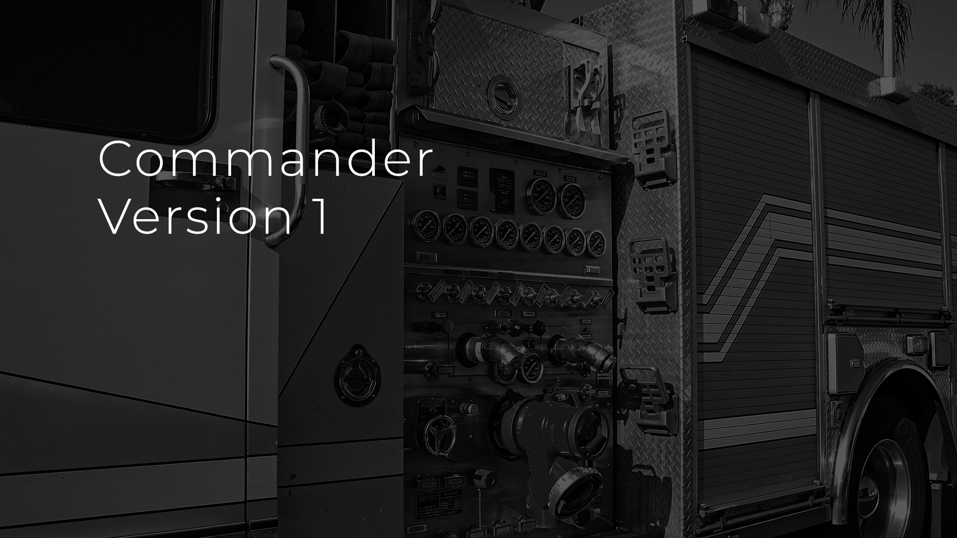
After research, I designed the version 1 prototype based on the findings throughout the user research.
Then, I tested the version 1 prototype with the local fire department's commanding officers and made iterations based on findings from the test to design the version 2 prototype.
After that, I conducted another round of user tests and finalized the design with version 3 prototype.
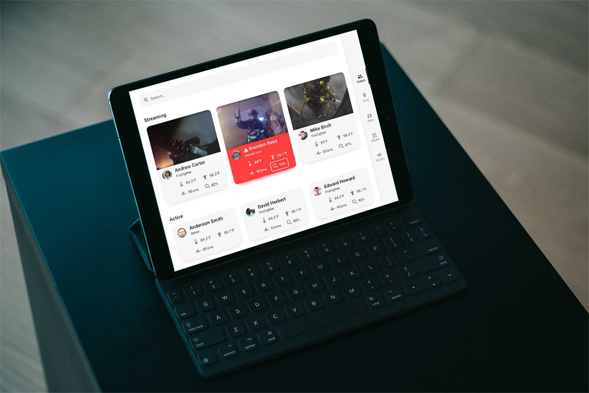
Crews
Research shows that a lack of visual information and inconsistent communication (sometimes units may miss their callsign) of radio makes it difficult for commanding officers to keep track of the unit's status.
So I came up with the "crews" tab which allows commanding officers to overview active unit's live streaming and other vital information such as pulse rate and body temperature.
During the research, I learned that it's easy for firefighters to have surging pulse rate or body temperature when they work in a burning building. This may cause them to pass out which can be extremely dangerous. Because of this, if a system detects abnormality from the unit's status (such as surging pulse rate or temperature) or if a unit activates the emergency signal, the commanding officers will be notified and that unit will be highlighted in red on this page.
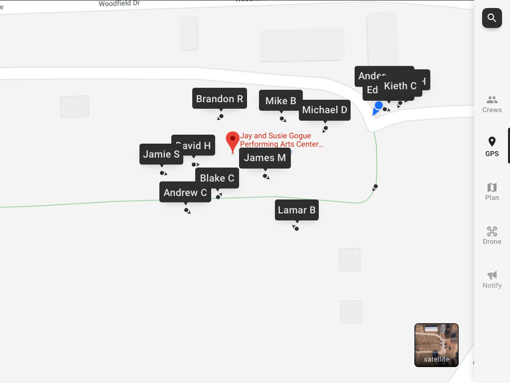
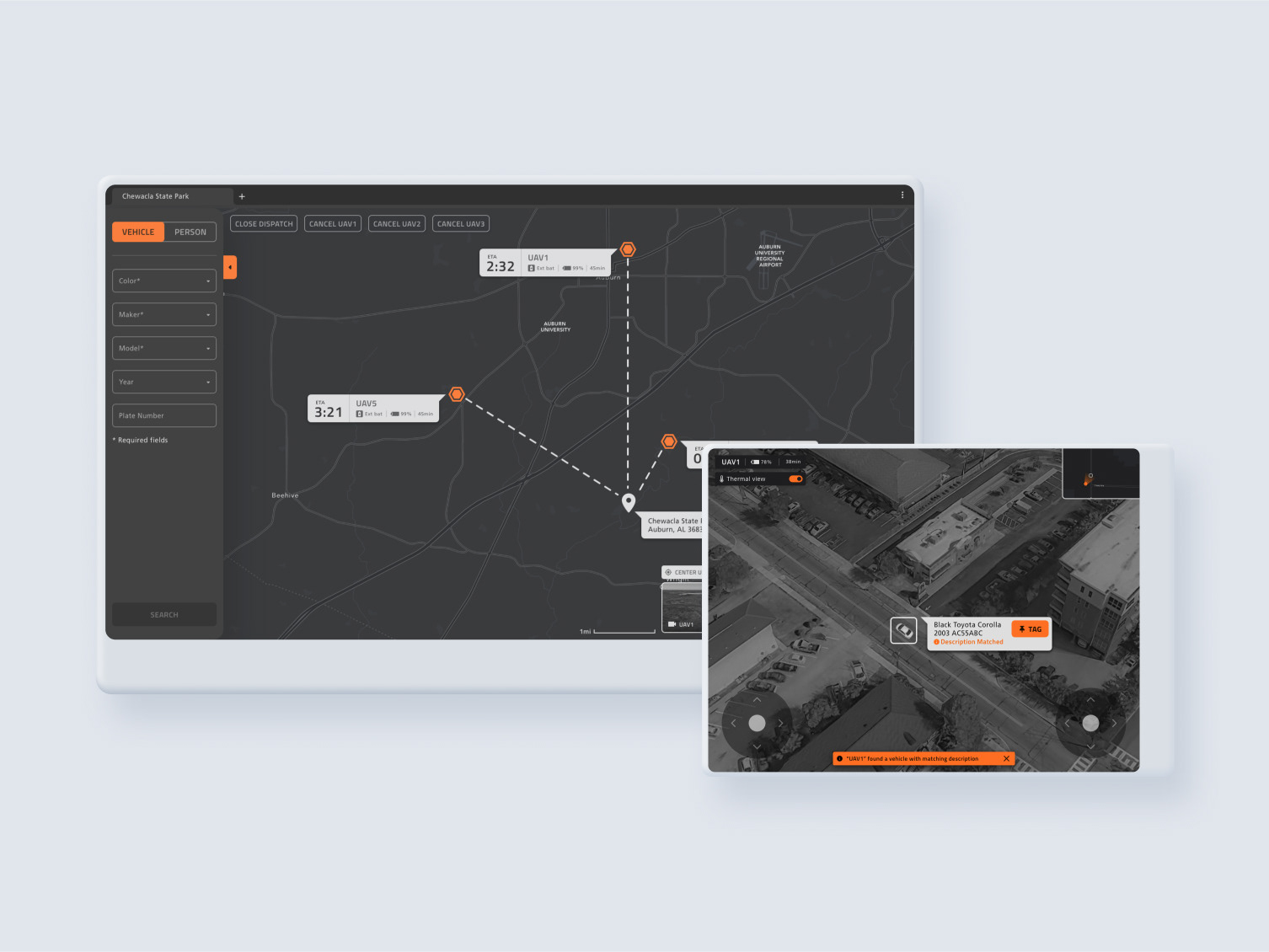
GPS
Commanding officer's main task is distributing limited units and resources most effectively at the firescene. But so far, soely relying on a radio made it difficult for them to keep track of who is located where. "GPS" tab aliviates this painpoint by visually displaying where units are located on the map by using GPS modules integrated in unit's AR device.
Also, GPS fucntion can be used to pinpoint a unit's general location if that unit is in trouble so other firefighters can reach to that unit as fast as possible.
Plan
During the research, I discovered that fire departments collect the floor plan of the major buildings within the city. These floor plans also indicate where crucial components are located such as fire control panel or gas line.
"Plan" tab displays these floor plans on the screen so commanding officers can plan the entry. Also for more effective communication with units, a commanding officer can tap the button on the bottom right corner to draw or write on the floor plan, these drawings will be displayed on units' "Plan" function on AR devices.
Drone
At the fire scene, drone footages can be utilized in multiple different ways. It can help firefighters to analyze smoke's behavior (such as its color and direction) to learn about fire's characteristic, show how fire is spreading in a birds-eye view, and locating survivors. Also, commanding officers can visually evaluate how resources are distributed by viewing information such as where fire trucks are parked.
During the research, I discovered that firefighters utilize multiple drones at the fire scene instead of relying on a single drone. To accommodate that, the interface is designed to allow commanding officers to view multiple drone cameras simultaneously as thumbnails. A commanding officer can tap on one of the thumbnails to view it as fullscreen.
Notify
Inconsistent communication (sometimes units may miss their callsign) of radio makes it difficult for commanding officers to relay orders to their units. Missing radio communication can be dangerous in cases such as a commanding officer orders units need to pull out of the building because of unstable structure.
"Notify" tab aimed to alleviate this pain point by allowing commanding officers to send a message to their units by typing in text. Once a message is sent, it will be displayed on all units' AR devices. If a message contains critical information, it can be highlighted by tapping the "emergency" button on the text field. Also, a notification can be sent to an individual unit by typing "@+name" similar to slack.
Banner Notification
During the research, I discovered that a firefighter can pass out while working in a burning structure due to heat. Abnormal biometric signs such as surging heartrates or temperatures can be early warning signs.
Because of this, the software notifies commanding officers with a pop-up banner if the system detects abnormal biometric signs or if a unit activates emergency signals. Tapping the pop-up banner takes a commanding officer to the "units" tab and highlights that unit's status.
Commander V1 user test
After designing the version 1 prototype, I conducted user tests with three local fire department commanding officers. The prototype was made with Adobe XD and displayed on the iPad.
Main findings
1. All three Commanding officers were above the mid-40s and felt uncomfortable with typing on touchscreens. Based on this finding, I had to revise the "notify" function to require less typing.
2. Two commanding officers gave feedback that they would mainly use the "notify" function to assign units for tasks. Later on, they gave me the feedback that they would like to have more of a "task management" function (assigning units on tasks) instead of the ability to send a message to units (because radio already exists for that).
3. One of the commanding officers suggested that units on the "units" page should be sorted based on tasks they are assigned so they won't have to keep track of it in their heads.
4. One of the commanding officers suggested displaying basic weather information such as wind direction, speed, and temperature on the “GPS” page so they can predict how the fire will behave.
Tasks
Throughout the test 1, I discovered that the demographic of commanding officers were resistant with typing on touch screens and preferred using radio instead. Also, two commanding officers gave feedback that they'd mainly use the "notify" function to assign units for tasks as "task management" function.
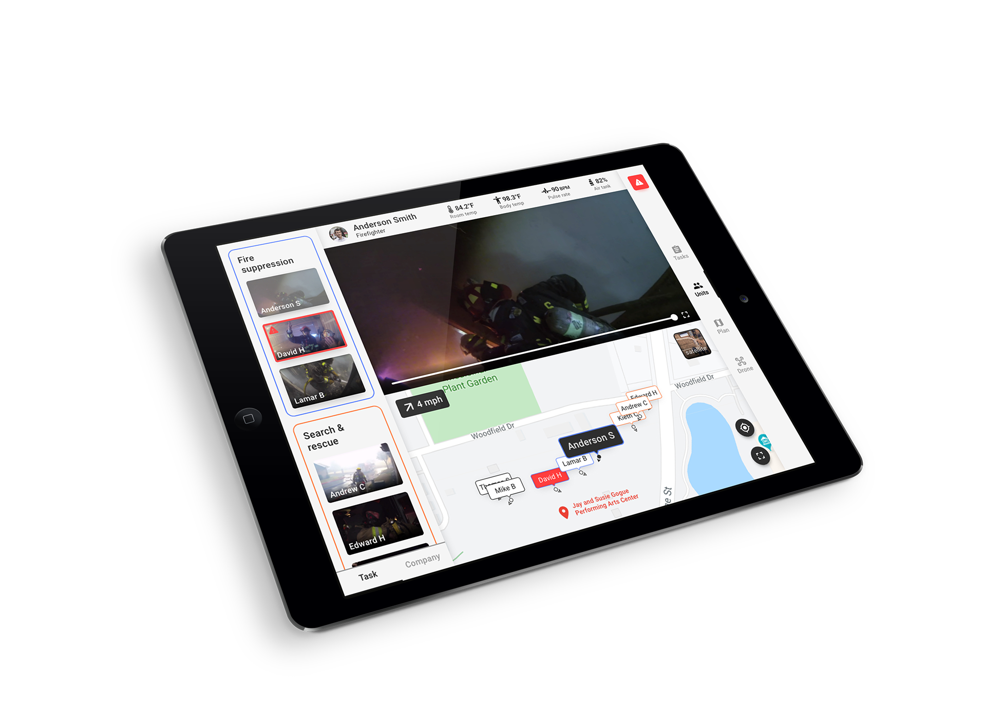
Based on these findings, on version 2, I replaced the "notify" tab with more task management oriented "tasks" tab. Commanding officers can create tasks and assign units or companies onto that task. In this way, commanding officers can gain a visual overview and keep track of which unit is assigned on which task. To cut down the time spent on creating a task and reduce typing, the system suggests commonly used task names. Once a task is created, a commanding officer can drag and drop units or companies to assign them to that task.
Units
On version 2, I merged the "GPS" tab with the "Units" tab so a commanding officer can view a unit's live streaming and location on the same page.
During the test 1, one of the commanding officers gave the feedback that units on the "units" page should be sorted based on tasks they are assigned, so they can gain a better overview. The system displays the list of active units on the left side of the screen as thumbnail videos and sorts them based on the task they are assigned.
Also based on feedback from a commanding officer, GPS map now displays wind's speed and direction so commanding officers can predict how the fire will behave.
Emergency Button
"Tasks" tab allows commanding officers to assign units on tasks but it doesn't prevent the issue of having inconsistent communication in case of an emergency situation (i.e. ordering fall back when the structure becomes unstable but a unit misses the radio call).
So on version 2, I added the "emergency button." In case of an emergency, the commanding officer can tap the emergency button on top of the navbar and select the type of emergency notification that will be sent out to units based on the context. This allows fast and reliable communication with units in an emergecny scenario.
Commander V2 user test
After designing the version 2 prototype, I conducted user tests with three local fire department commanding officers who are different from the first test. The prototype was made with Adobe XD and displayed on the iPad.
Main findings
All three commanding officers who participated in the second test struggled to interact with the "units" page and I had to make improvements based on findings.
1. On the "Units" tab, all three commanding officers tried to select units first before creating a task but on version 2, a task had to be created first to assign units. I learned that system should allow a user to select units first before creating the task.
2. One of the commanding officers thought the "+add" button that displays during the task creation process was for adding more keywords instead of a confirmation button for creating a task.
3. All three commanding officers struggled to drag and drop a unit to assign them to a task and took about 15-20 seconds to accomplish it. I discovered that drag and drop interaction was unsuitable in a scenario when every second count. So on version 3, I changed it to checkboxes so a commanding officer can select multiple units at once and assign them to a task instead of having to drag and drop them one by one.
4. One of the commanding officers tried to tap a name tag on the map instead of using the left panel when I instructed him to open that unit's status. I wasn't expecting that behavior and on version 3 I allowed a user to tap a nametag on the map to view that unit's status.

Tasks
Throughout the second test, I discovered that all of the commanding officers struggled using drag and drop interaction for assigning units. All commanding officers took about 15-20 seconds to drag and drop units to assign them to a task and I realized it was unsuitable for emergency application. Based on this finding, on version 3, I replaced drag and drop interaction with checkboxes. This allows a commanding officer to select multiple units and assign them to a task at once.
Also during the testing, I discovered all three commanding officers tried to select units first before creating the task. Checkbox interaction allows a commanding officer to select units first by allowing a commanding officer to select units to assign before creating the task.
Finally, I discovered that one of the commanding officers thought the "+add" button on version 2 was for adding more keywords instead of a confirmation button for creating a task. On version 3, once a commanding officer taps the suggested keyword, it automatically creates a task instead of having to confirm it.
Task assignment override
On the "tasks" tab, there can be an edge case when a commanding officer tries to assign an already assigned unit to a different task. when it happens, system displays a confirmation pop-up. If a commanding officer confirms it, that unit is assigned on a different task and gets unassigned from the previously assigned tasks.
Units
On version 3, the wind direction indicator arrow on the top left corner of the map has changed to a line arrow because multiple commanding officers struggle to tell the wind's direction with the previous arrow icon. Also, the text of task names on the left panel became smaller to save up more space.
Plan
The "plan" tab has not changed since version 1.
Drone
The "drone" tab has not changed since version 1.
Conclusion & Takeaways
After finalizing the design with version 3, I made a product intro video below. I showed the finalized design to local commanding officers and their feedbacks were positive.
I posted the product video a few months later on r/firefighting for the online firefighter community's feedback. Feedbacks were mostly negative but those were directed at the AR device, not the tablet software. One of the commenters saw the benefit of allowing commanding officers to view their unit's live streaming. But Since Layer FD is a concept product there was no real way to measure success.
The biggest takeaway I learned throughout this project is "consider user demographic." At the beginning of the project, I failed to predict that commanding officers will struggle to type on touchscreens because of they are old. So I had to steer the product to not require any typing.
I would like to thank Auburn fire department commanding officers for helping me conducting research and test throughout this project.