Sprout is a IoT household indoor farming device with an accompanying mobile app.
The project started as a college project. Throughout the project, I worked with Georgia Tech Industrial Design student Heyward Smith. Heyward designed the hardware and I designed the interfaces of accompanying mobile app.
After the project, I met Carl Palme, CEO of Boundless Robotics. I converted the app's UI design to match Boundless Robotic's branding and hardware specs and this project became a deliverable for a real product on the market.
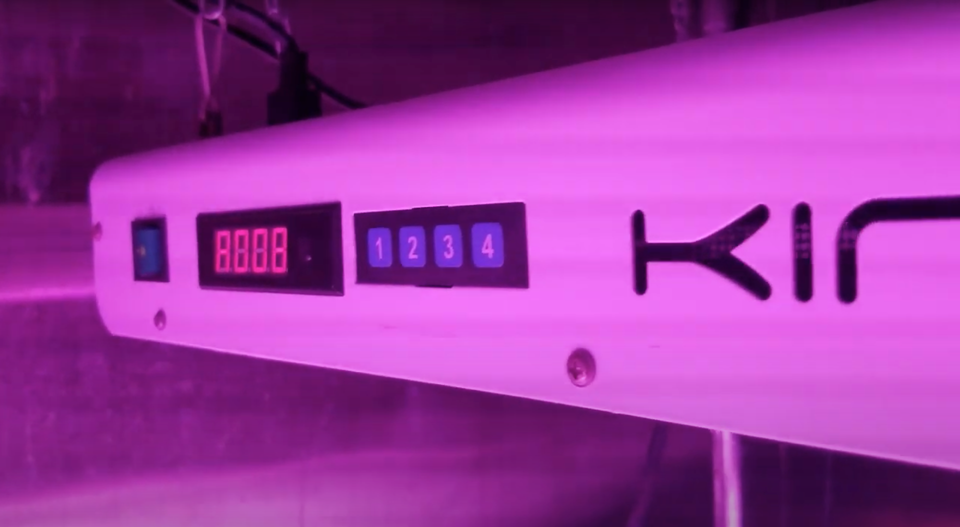
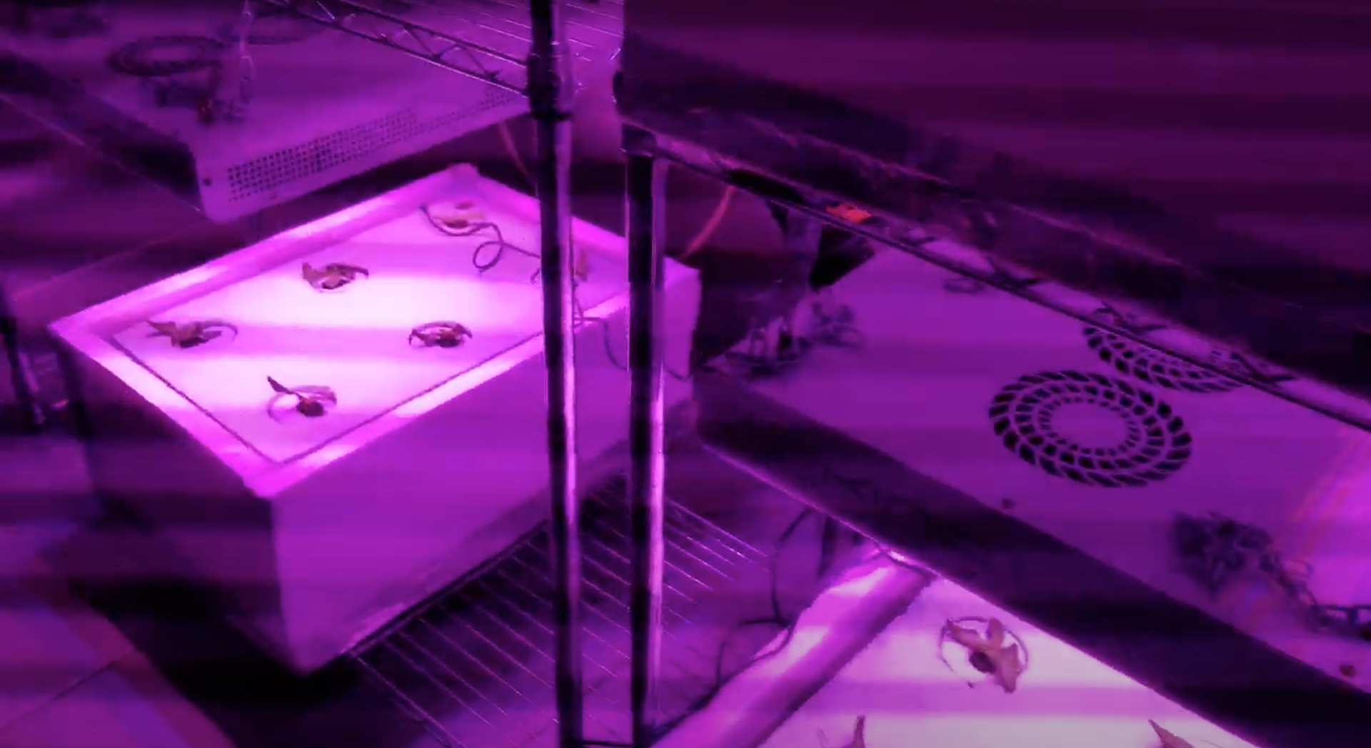
Hardware designed by Heyward Smith
Problem
Pollution and the negative environmental impact of industrial farming increased the demand for indoor farming technology.
Existing indoor farming products were riddled with problems such as lack of customizability, high price, energy inefficiency, and outdated UI/UX which hindered mass adaptation.
Solution
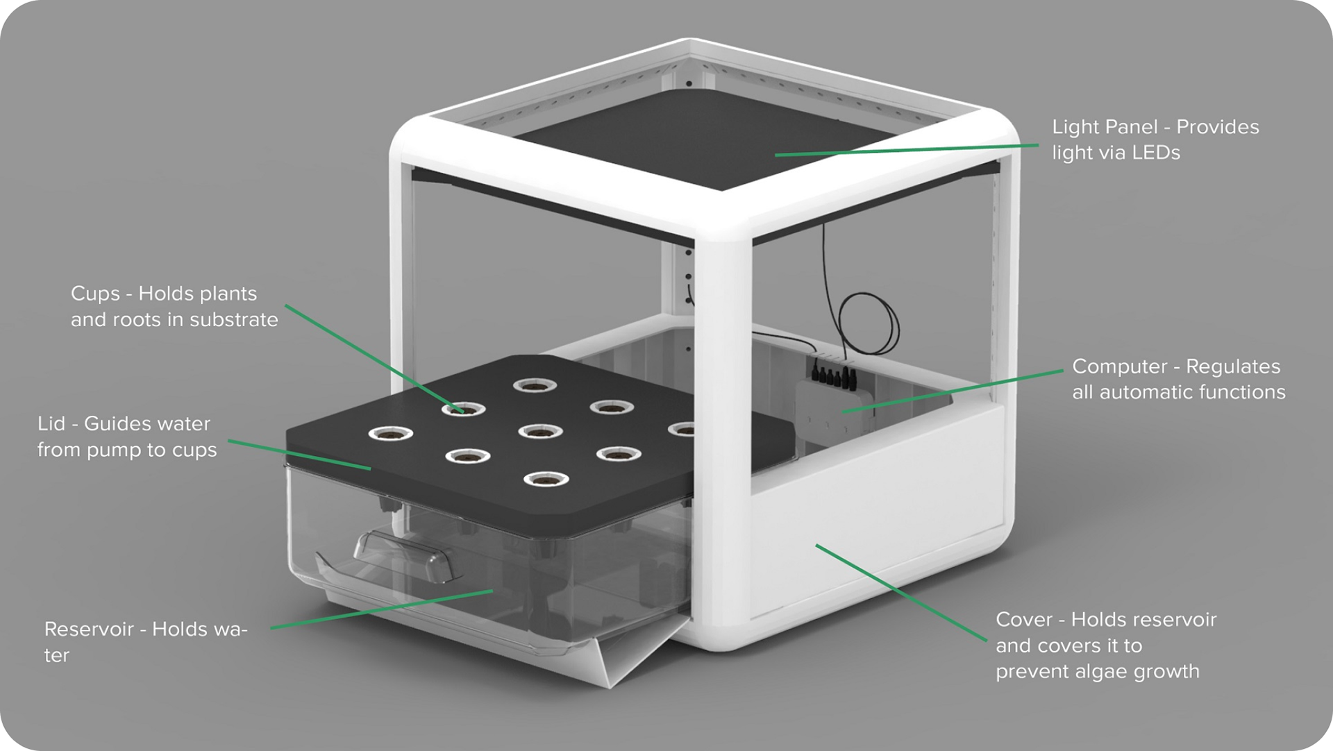
We envisioned a new type of indoor farming device that would allow easy expansion, maintenance, and low entry cost. This was achieved by designing the hardware to be modular.
Users can install additional sensors to the hardware and to display additional data gathered by additional sensors, I employed a card system to design a flexible and scalable UI.
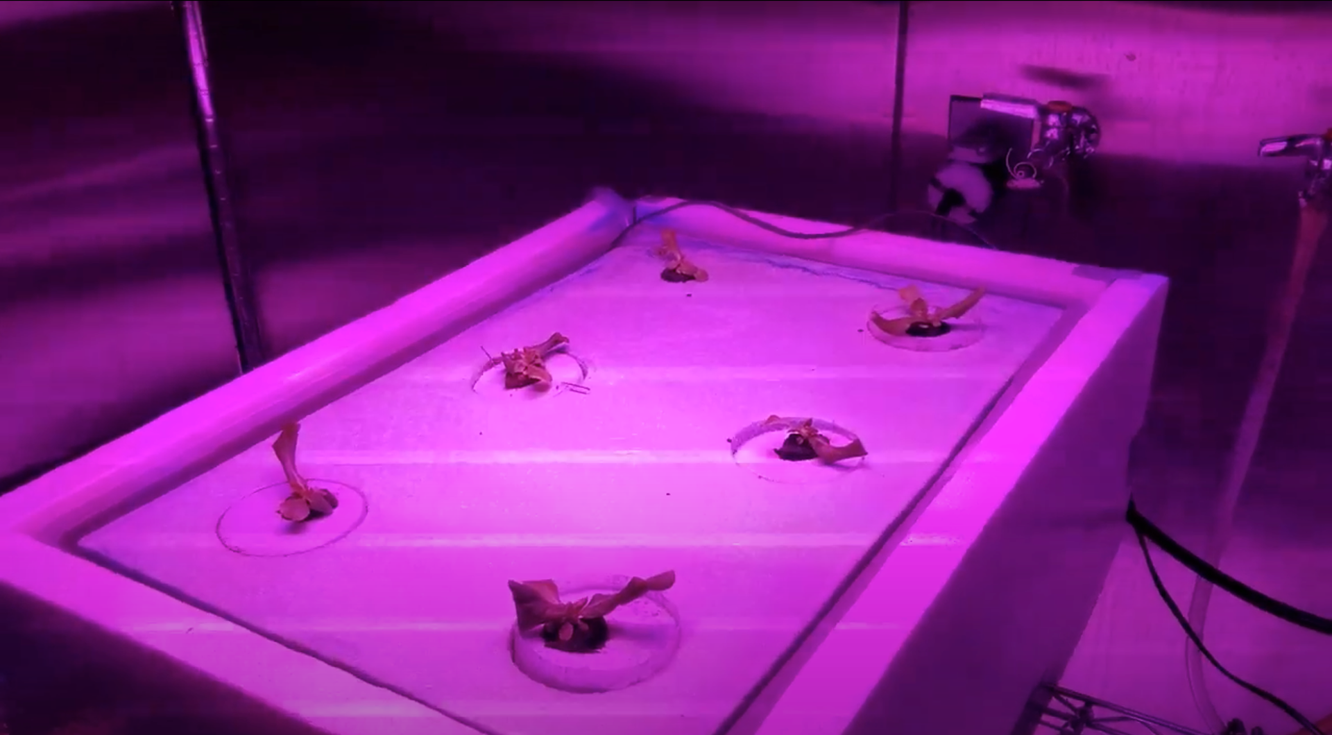
Auburn University's environment chamber
Industry Expert Interview
At the beginning of the project, I interviewed Auburn University Horticulture Department faculty member, Dr. Daniel Wells, to learn about the needs and constraints of indoor farming through contextual inquiry.
From the conversation, I learned how aspects such as lighting's intensity and duration, and water quality such as pH level dictate the crops' quality.
This gave us insight regarding what is the information that should be displayed and aspects that are controllable from the app.
Competitive Benchmark
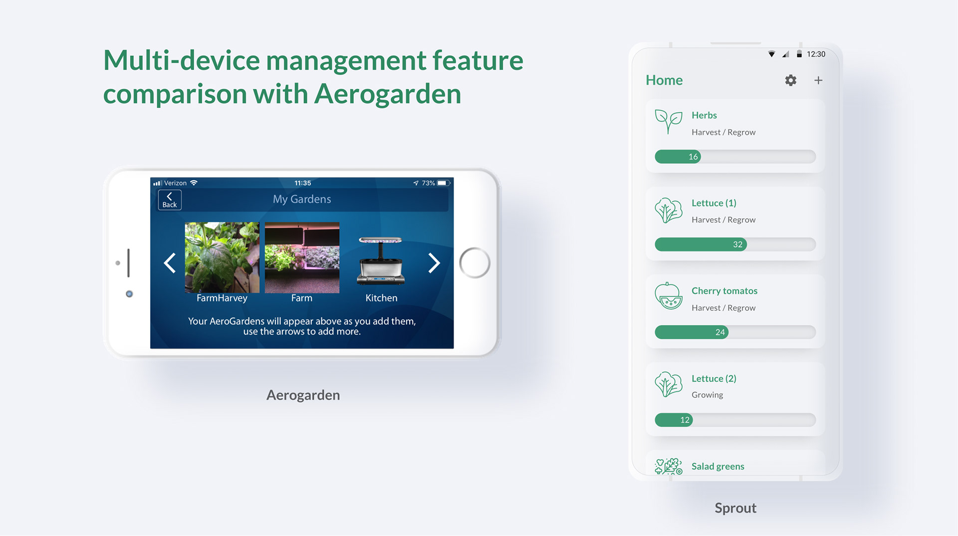
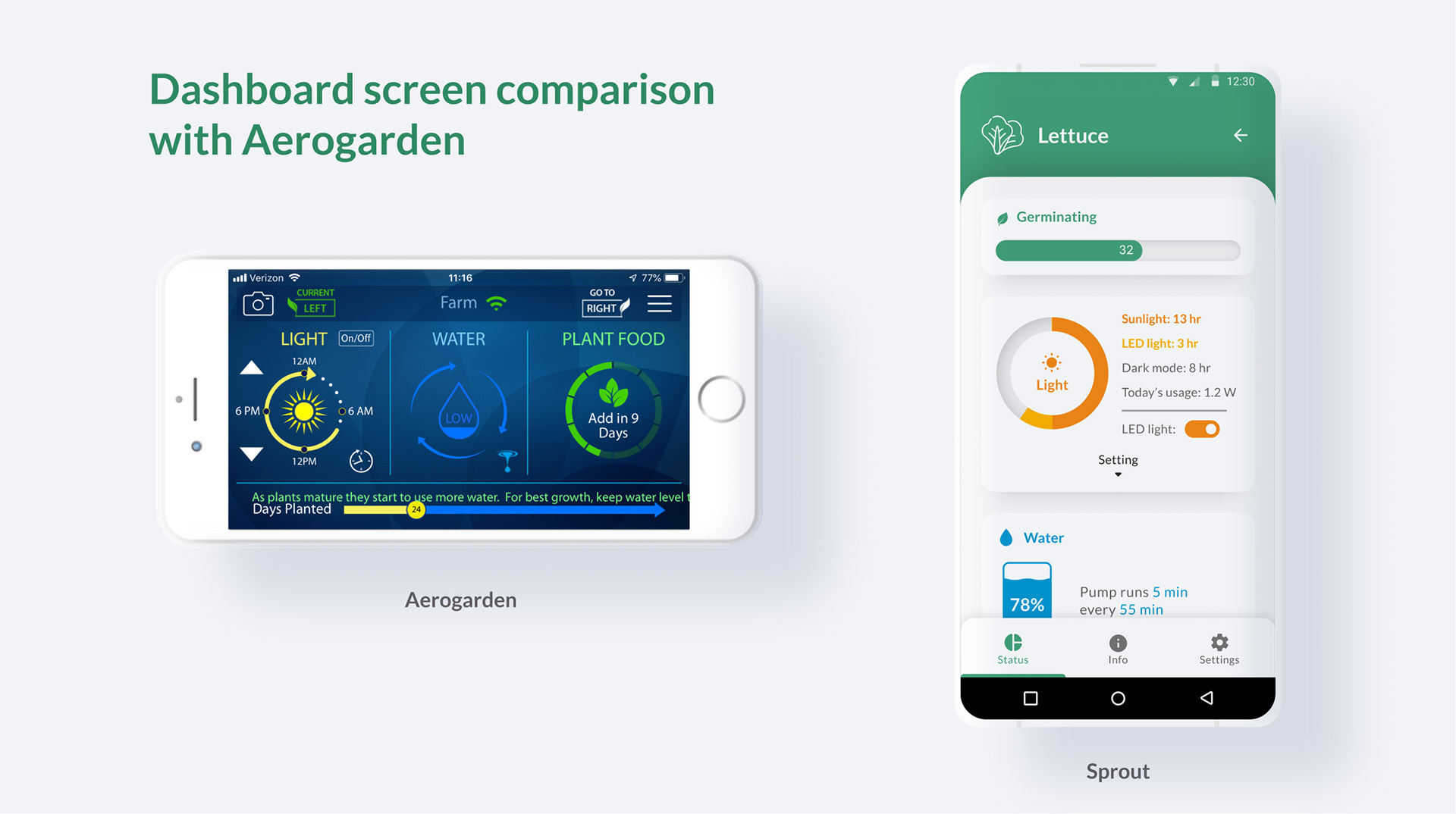
for the competitive research, I purchased Aerogarden, which is the most common indoor farming device to learn the features they are offering and existing pain points.
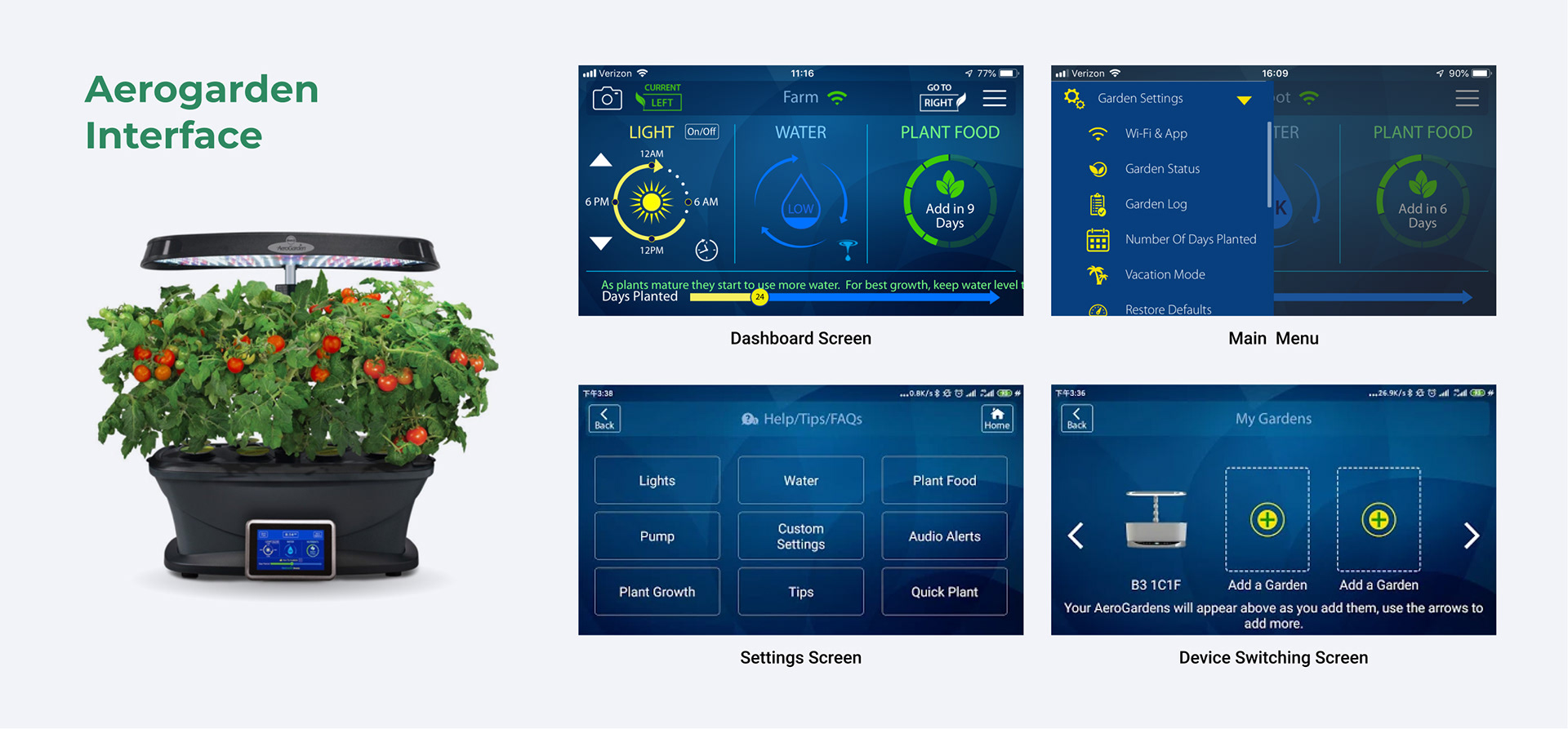
Existing Features
• Nutrient
• Water level & cycle (+scheduling)
• Lighting (+scheduling)
• Growing days
• Gardening tips
Pain Points
• Information overload
• Difficulty of overviewing multiple devices
• Bad accessibility by excessive brand color
• Mismatched mental model
• No vertical screen mode
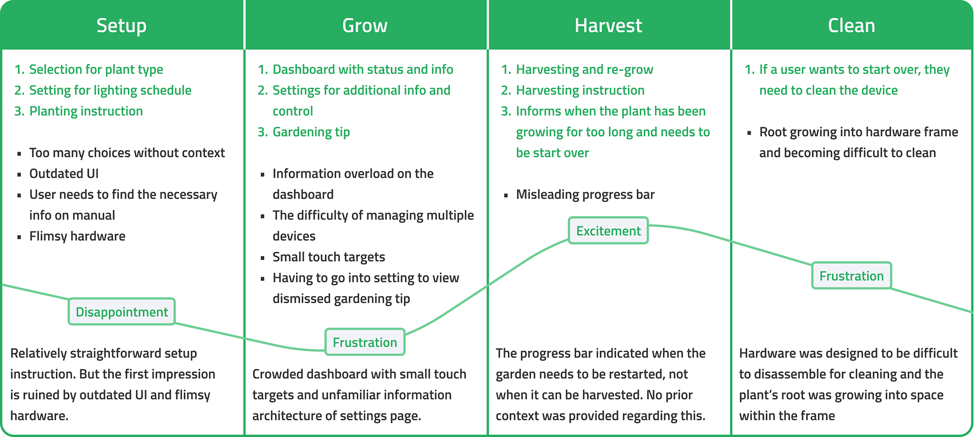
As part of competitor benchmarking, I generated the journey map of Aerogarden's product
Quantitative Research
As a part of the initial research, we ran a survey as quantitative research to gather the data from the broader sample size.
We created the survey using Google forms and posted it on the subreddit r/aerogarden.
Throughout the survey, we asked open-ended questions and prioritized the data based on the ratio of answers.
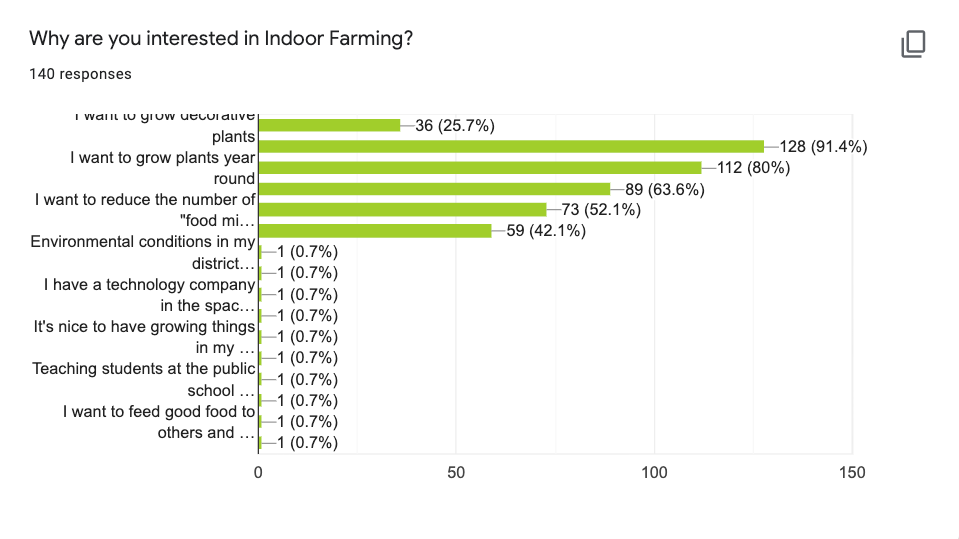
Main findings
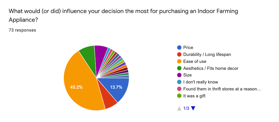
• When choosing the product, ease of use came up as the most important factor.
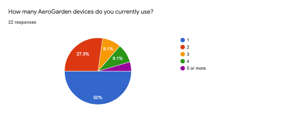
• More than 50% of users own more than a single Aerogarden device.
• Price and maintenance came up as the biggest pain point.
• The majority of Aerogarden's users perceived the ability to remotely control lighting and pump and receive notifications regarding water and nutrient levels as necessary features.
• A notable amount of Arogarden users pointed out the lack/difficulty of advanced customization as a major pain point. For example, Aerogarden users had to cut out the plastic cover of the hardware device in order to install a PH sensor to track the water quality.
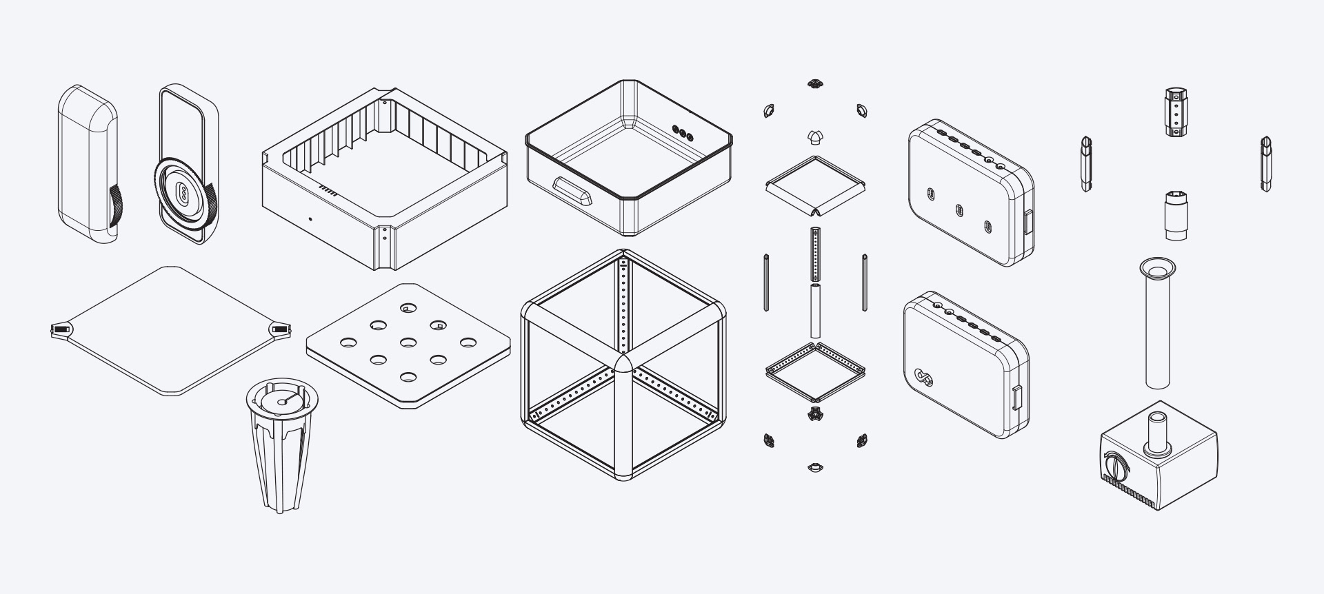
Modular hardware design by Heyward
Data from quantitative research showed consumers desire an indoor farming product that is:
• easy to manage multiple devices
• low cost
• easy to customize
• low cost
• easy to customize
To achieve this, Heyward designed the hardware to be a modular system for easy customization, maintenance, and low entry cost.
Because of this, I had to design the app to...
• Be scalable, since users can install additional sensors to the hardware and the app had to display additional data gathered by additional sensors
• Have an intuitive onboarding experience to help users to assemble modular hardware.
Feature Scoping
Based on research data and hardware specs, I scoped the main features of the app.

Basic features
• Sign-in
• Sign-up

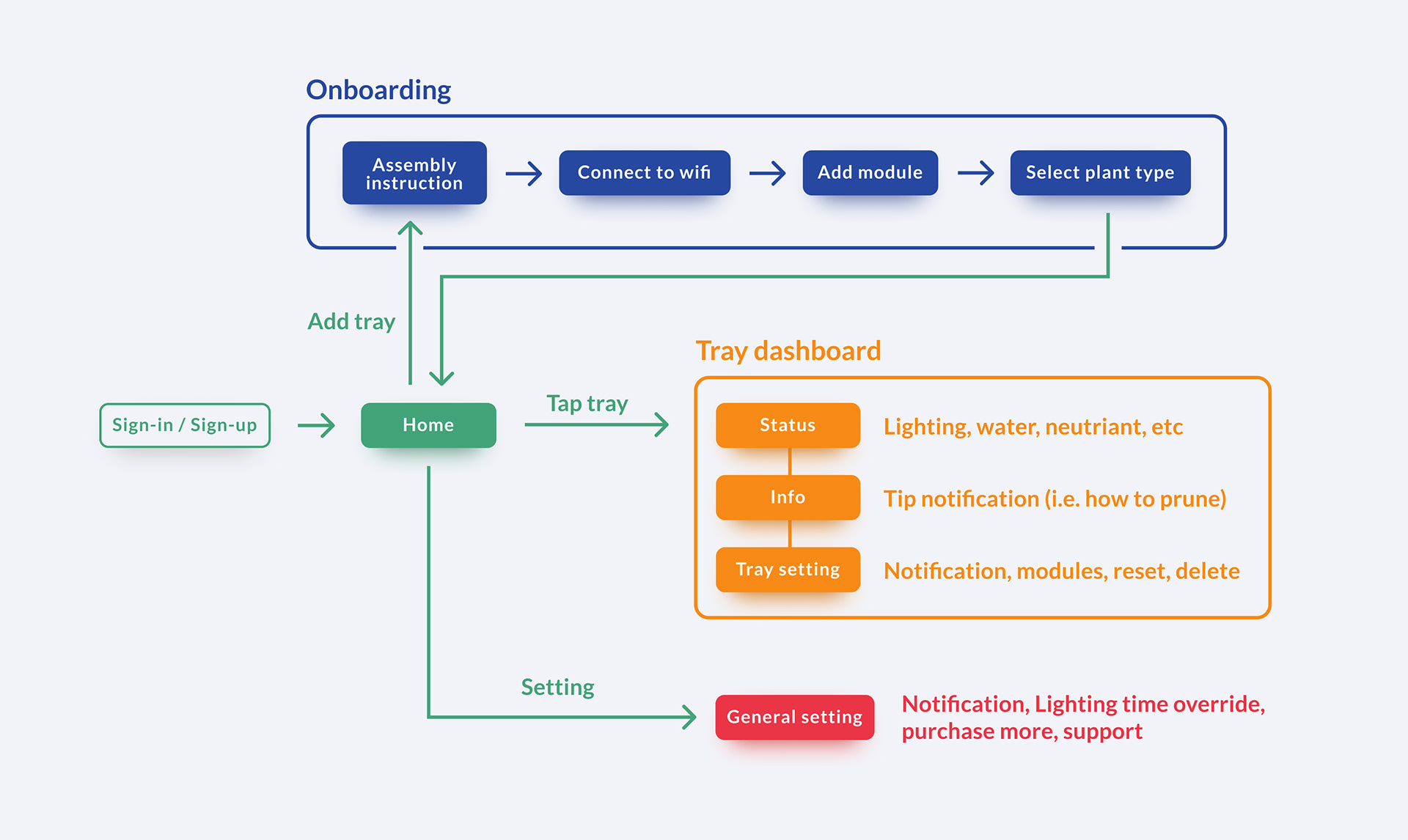
On-boarding
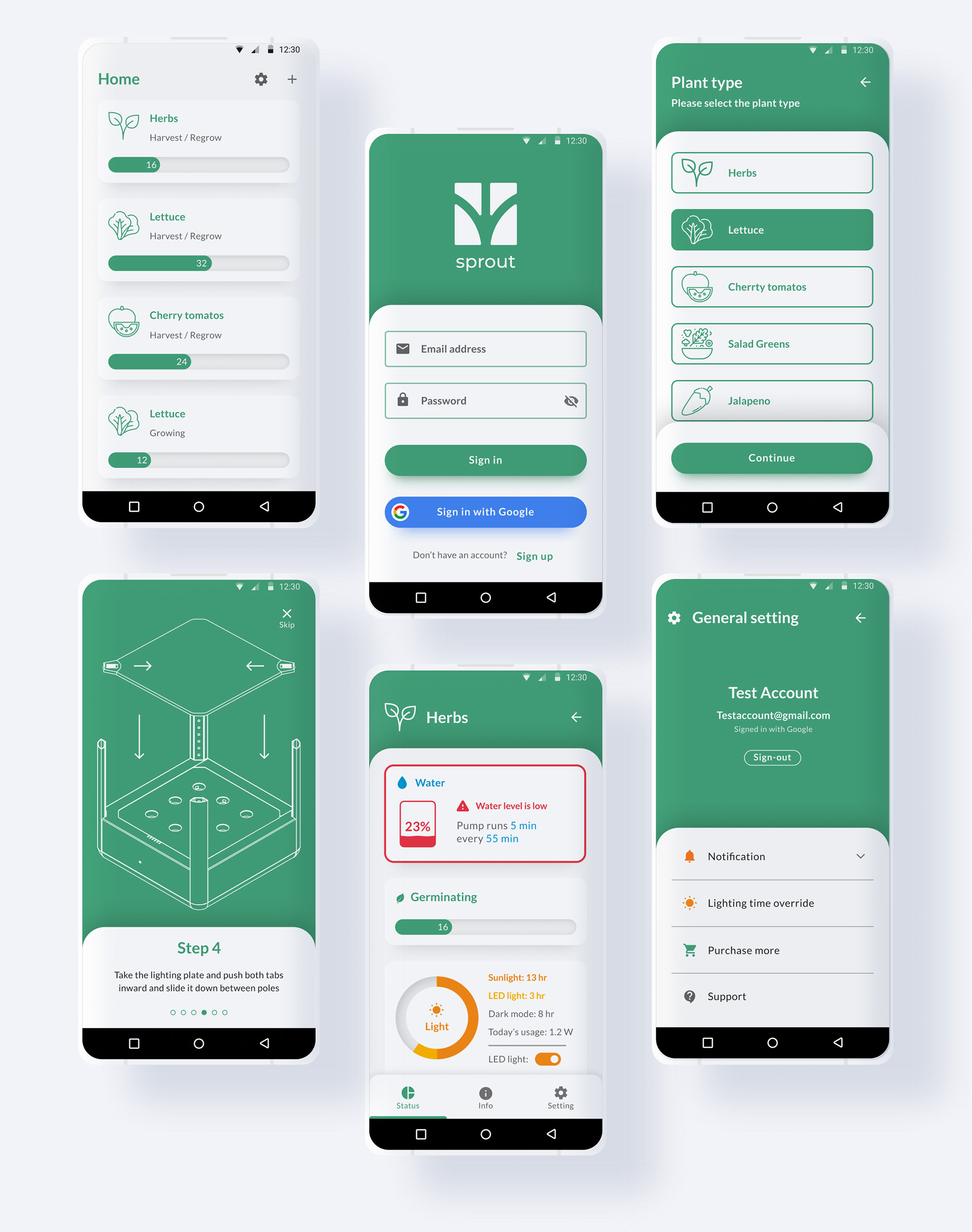
Sprout's hardware was designed to require assembly and wifi connection. Because of this, there had to be clear and easy-to-understand set-up instructions displayed on the app.
• Assembly instruction
• Connecting to wifi
• How to add module
• Select plant type

Device List (All Devices)
The survey showed that more than 50% of users own more than a single indoor farming device. Because of this, the home feature was designed to allow users to easily manage multiple devices.
• Home

Dashboard (Individual Device)
Environmental factors such as lighting and water quality must be well regulated for the best quality crop. The dashboard was designed to display data about individual devices and to allow users to control the environment remotely.
• Status (Lighting, water level, nutrient, pH, PPM, etc...)
• Info (Growing tip notifications)
• Setting

General Setting
The general setting was added for a user to change the settings of multiple devices at once, so a user won't have to make changes by going into an individual device's dashboard.
• General notification setting
• General Lighting setting
• Link to the store page
• Customer Support
Information Architecture
Based on scoped features, I laid out the information architecture of the app.
Early Sketches
I drew sketches to ideate the UI
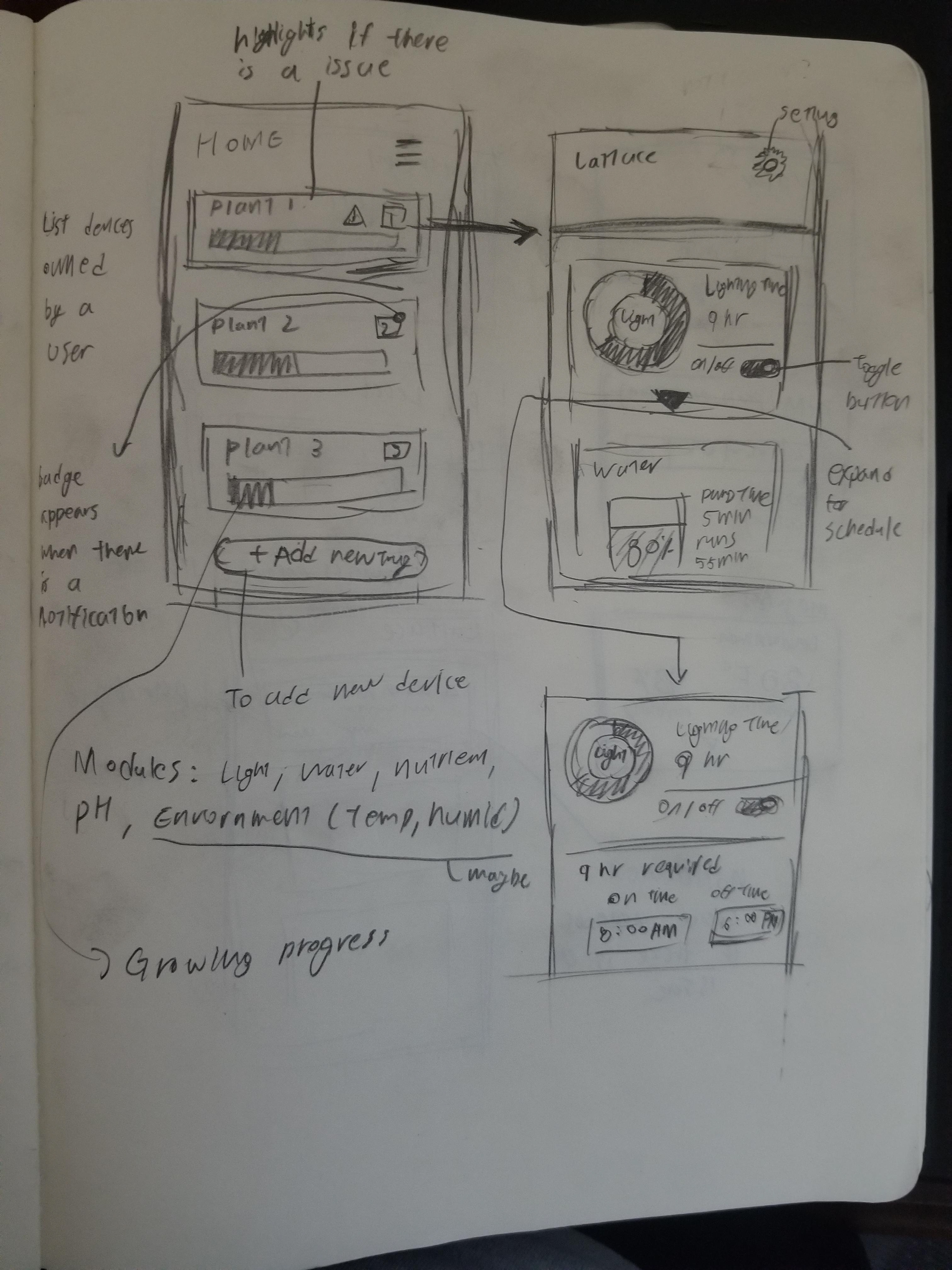
The home and dashboard screens were designed to allow an easy overview of information and management of devices.
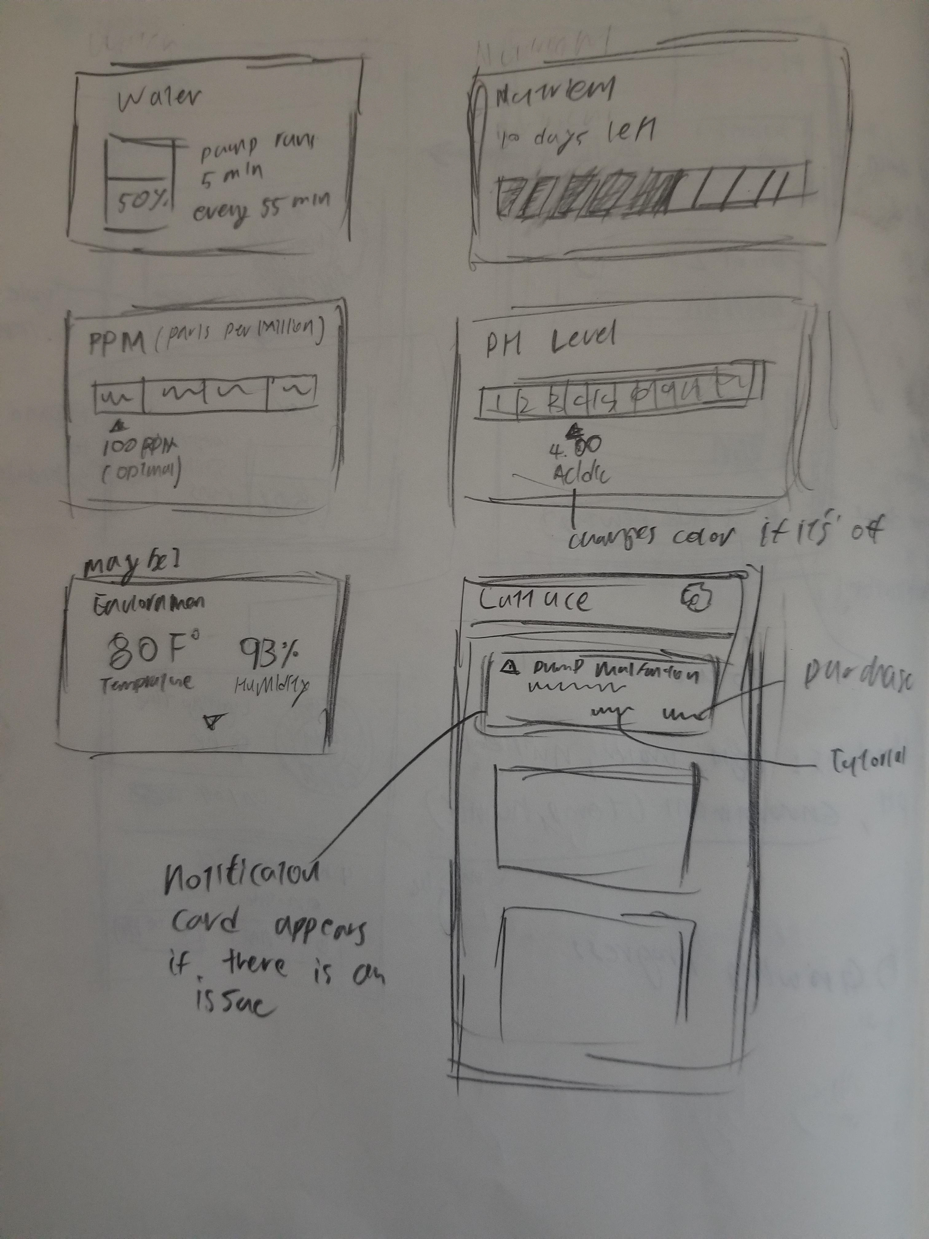
Since the hardware was designed to be a modular system that allows users to add additional sensors, I design the app's interface to be flexible and easily scalable with a card system.
Wireframes
Wireframes were drawn to define the details of UI such as layouts and copies.
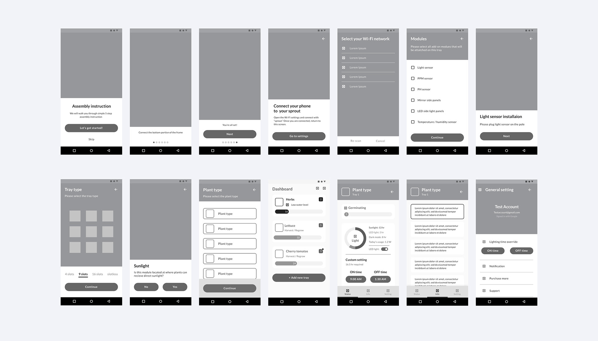
After wireframing, I made the version 1 prototype with Figma then conducted user tests and made revisions based on the test findings.
Down below are the final screens that include the changes after testing.
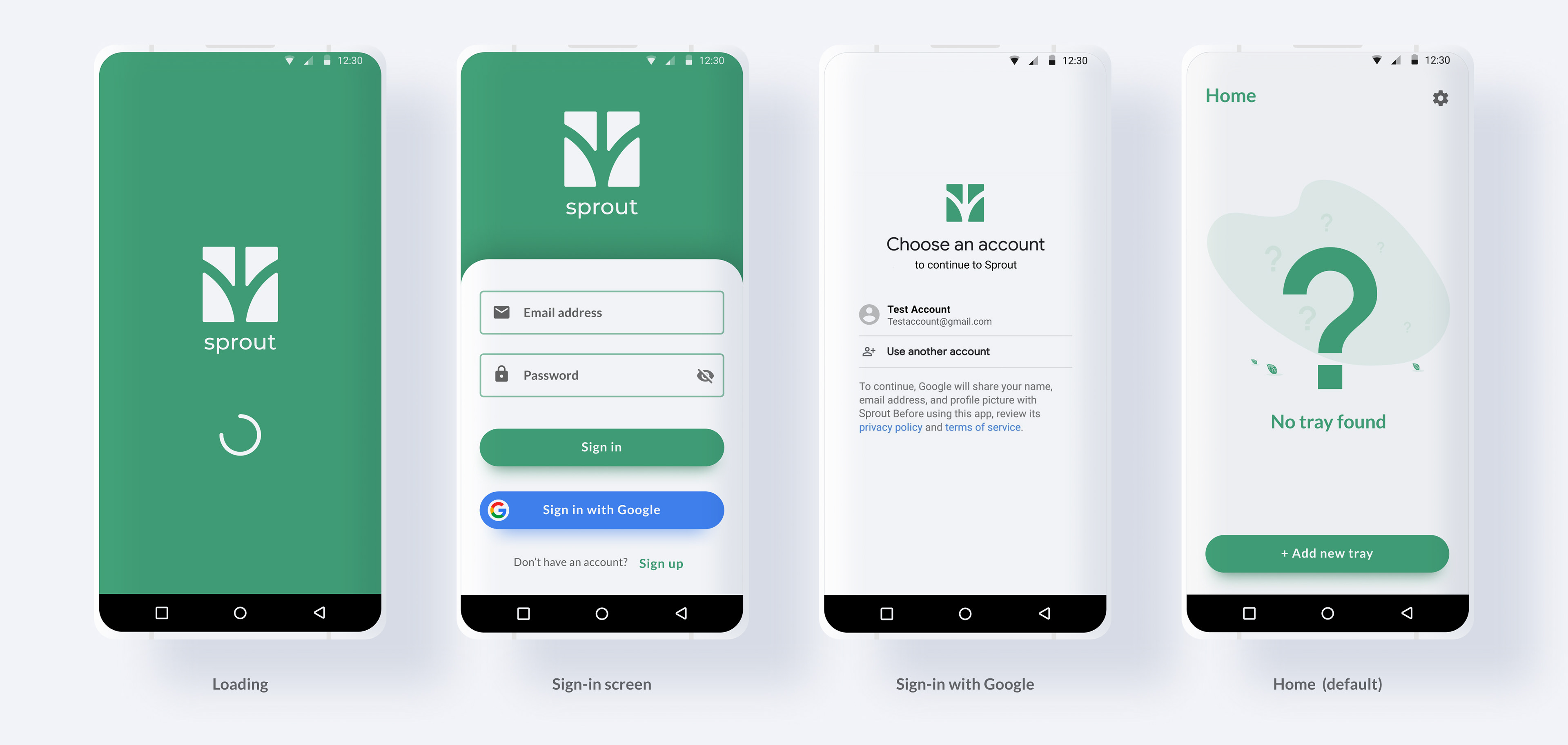
Sign-in Screens
For sign-in processes, I used best practices commonly used by most consumer apps to accommodate existing mental models.
On-boarding Process
45.2% of users picked "ease of use" as the most important factor when it comes to purchasing indoor farming devices. In contrast, Sprout's hardware was designed to require assembly and wifi connection. Because of this, there had to be clear and easy-to-understand set-up instructions displayed on the app during the onboarding.
Assembly instruction
For assembly instruction, I animated how parts go together by using the auto animate feature on Figma.
This gives a more intuitive onboarding experience by visualizing how parts fit in together as step-by-step instruction.
The user test was conducted with 5 random participants and all participants agreed animating hardware assembly instructions made the onboarding experience easier.
Connect to Wifi
Since Sprout is an IoT device, users had to connect the device to wifi to sync the device with the smartphone app.
I researched the best IoT onboarding practices of Amazon Echo as a reference and applied a similar process to match users' mental models.
Add module
Sprout's hardware was designed to be modular to allow users to install additional modules for additional features. This keeps entry costs low and allows for easy expansion.
If a user purchased additional modules, a user can select those modules during the onboarding and the app will display how to install those modules.
Tray & plant setup
Users can choose between different types of trays to grow different types of plants.
A user can select the tray and plant type during the onboarding so the system can automatically calibrate lighting time and pump cycle.
Home Screen
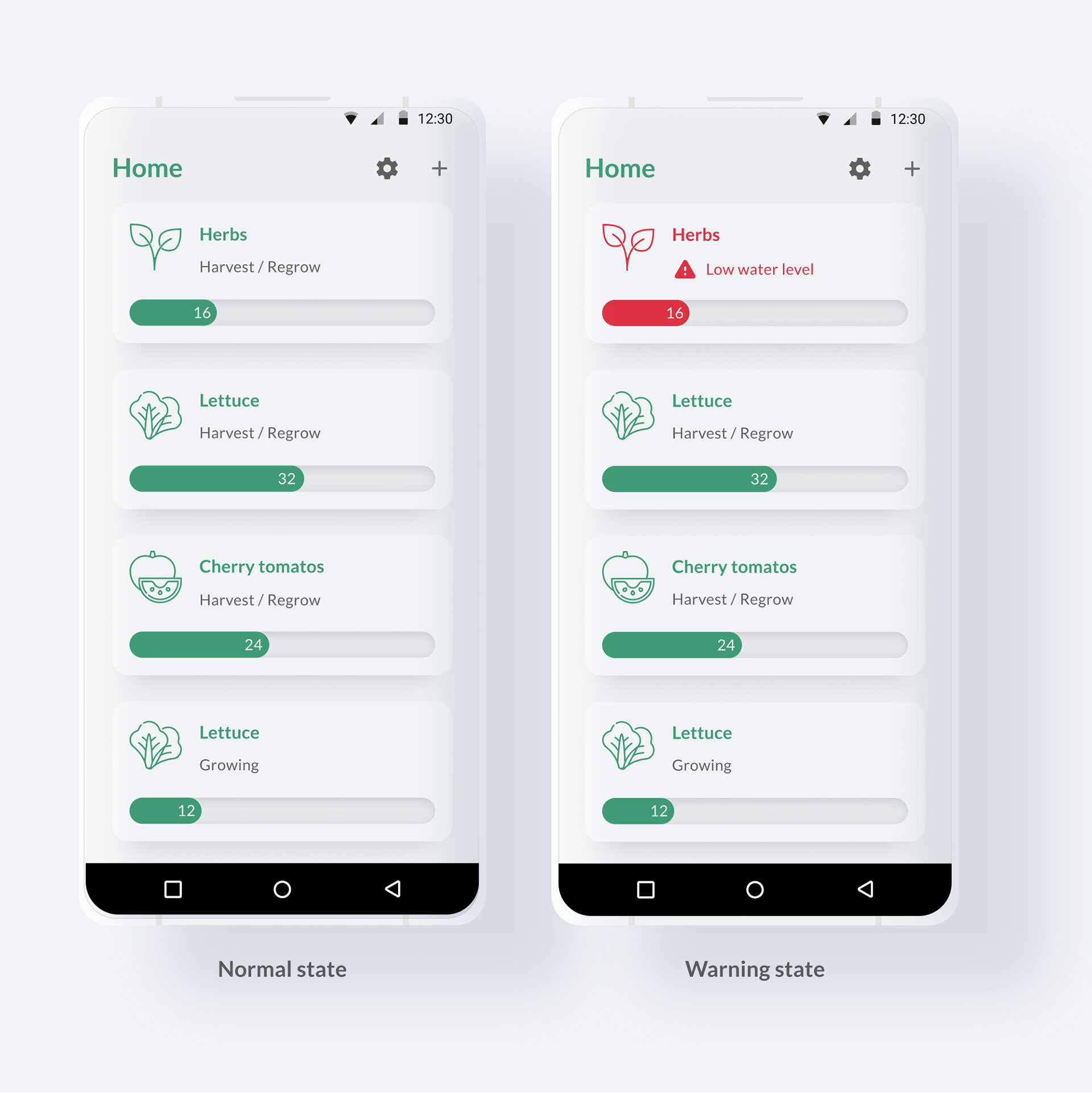
The home screen displays the list of devices that the user owns and displays high-level information on individual devices in a single place.
Home screen
Research showed 50% of the users own more than a single device.
But managing multiple devices was difficult on Aerogarden's app because users have to open the menu and go to the "my gardens" page and switch between devices. Also, the "my gardens" page didn't provide any overview information of owned devices.
So, on Sprout, I added a "Home" screen where users can view the list of owned devices and gain overview information of owned devices. Users can tap one of the device cards to view that device's status in detail (dashboard).
If a device experiences an issue that requires the user's action, that device's card moves to the top of the list, highlights in red, and displays a warning icon with a message to ensure a user takes action.
Change after user test
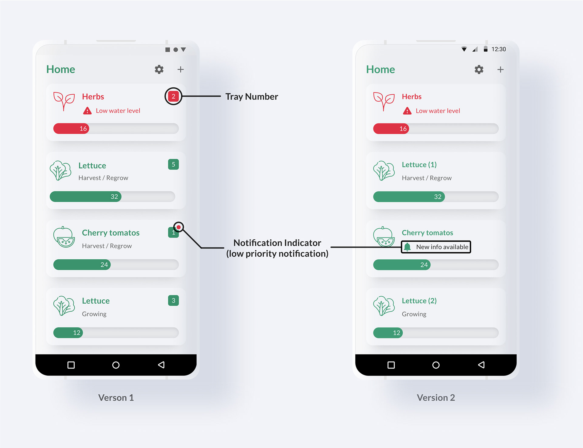
There was an edge case where a user owns multiple devices and started to grow the same type of the plant on the same day. Because of this, a user may get confused if one of the devices experiences problems because they are both visually the same on the home screen. To solve this, on version 1, I added a tray number on the top right side of each device card.
During the user test, 3 out of 5 participants perceived the tray number indicator as a notification badge, and assumed numbers indicate the number of unread notifications. Also, indicating low priority notification as small red dot confused participants from understanding the difference between warning and low priority notification.
So on version 2, I made both low priority notification and warnings to display the message directly on a device card, yet visualized the difference in urgency with colors and icons.
Dashboard
When a device card is tapped from the home screen, a user is taken to the dashboard screen of that device, which displays detailed information.
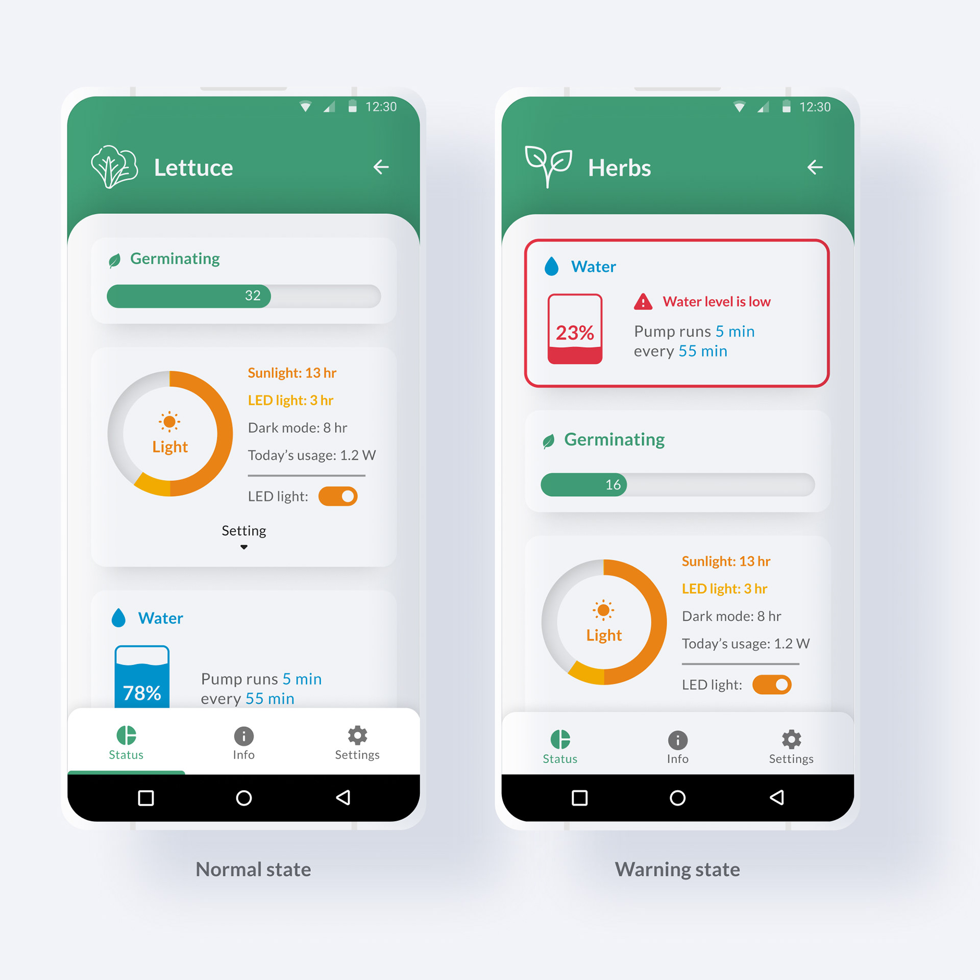
Dashboard (status)
The status tab displays information generated by sensors and allows users to control attributes such as lighting.
If a sensor detects an issue that requires a user's action (i.e. low water level), the card that is correlated with the issue will turn into a warning state and move to the top to ensure a user takes action.
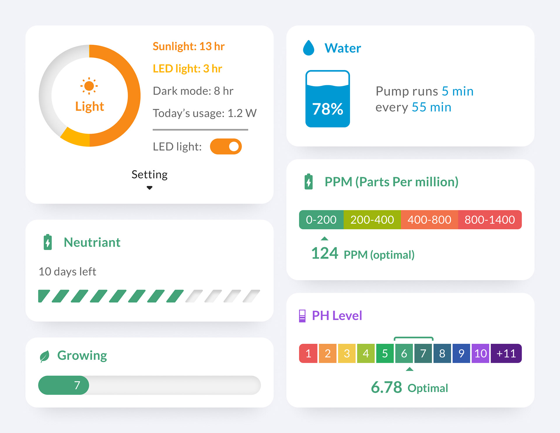
Card system design
The modular hardware characteristic created a design challenge where if a user adds more sensors, more information has to be displayed on the status tab. The card system was suitable to solve this problem due to its flexibility and scalability.
On the status tab, each card represents data generated by each sensor. For example, if a user adds a pH sensor module on the device, a pH card will appear on a status tab. The card system's flexibility makes it possible to display various sizes and numbers of status cards.
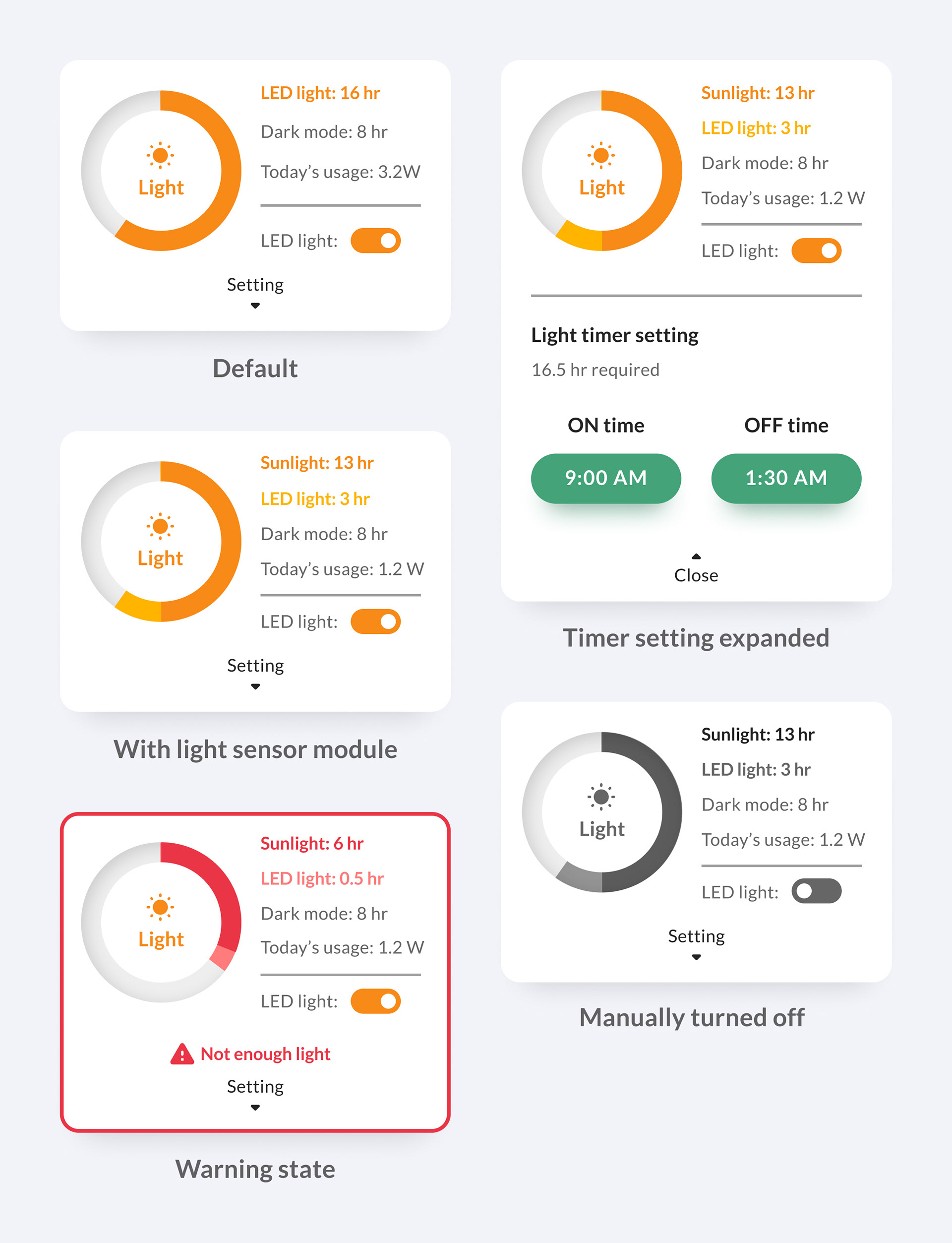
Lighting card
Competitive research showed the necessity of a feature which allows users to:
• view information about lighting duration
• schedule lighting time (when to turn on/off)
• temporary turn on/off lighting manually
• view information about lighting duration
• schedule lighting time (when to turn on/off)
• temporary turn on/off lighting manually
To achieve this, a lighting card was added to the status tab which:
• displays how much light the plant received
• displays how much energy was used (since most of the users are environmentally conscious)
• turns into a warning state if the plant is receiving not enough or too much light so a user can take action
• toggle button for temporarily turn on/off the light manually
Research showed that one of the drawbacks of indoor farming is the energy cost. Sunlight sensor can be added to the hardware to measure how much natural light the plant receives and applies the only necessary amount of light to save money and energy. The card system's flexibility allows the lighting card to expand to display additional information if a light sensor gets added.
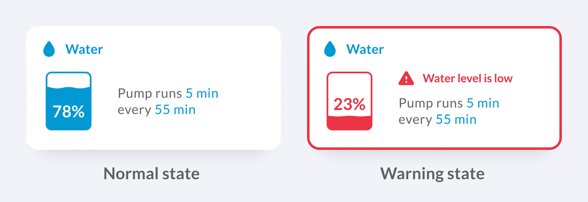
Water card
Competitive research showed the necessity of a feature that alerts users if water needs to be refilled. The water card was designed to visualize the water level of the tank and alert the user to take action if the water level is low or the pump fails by turning into a warning status and moving the card to the top.
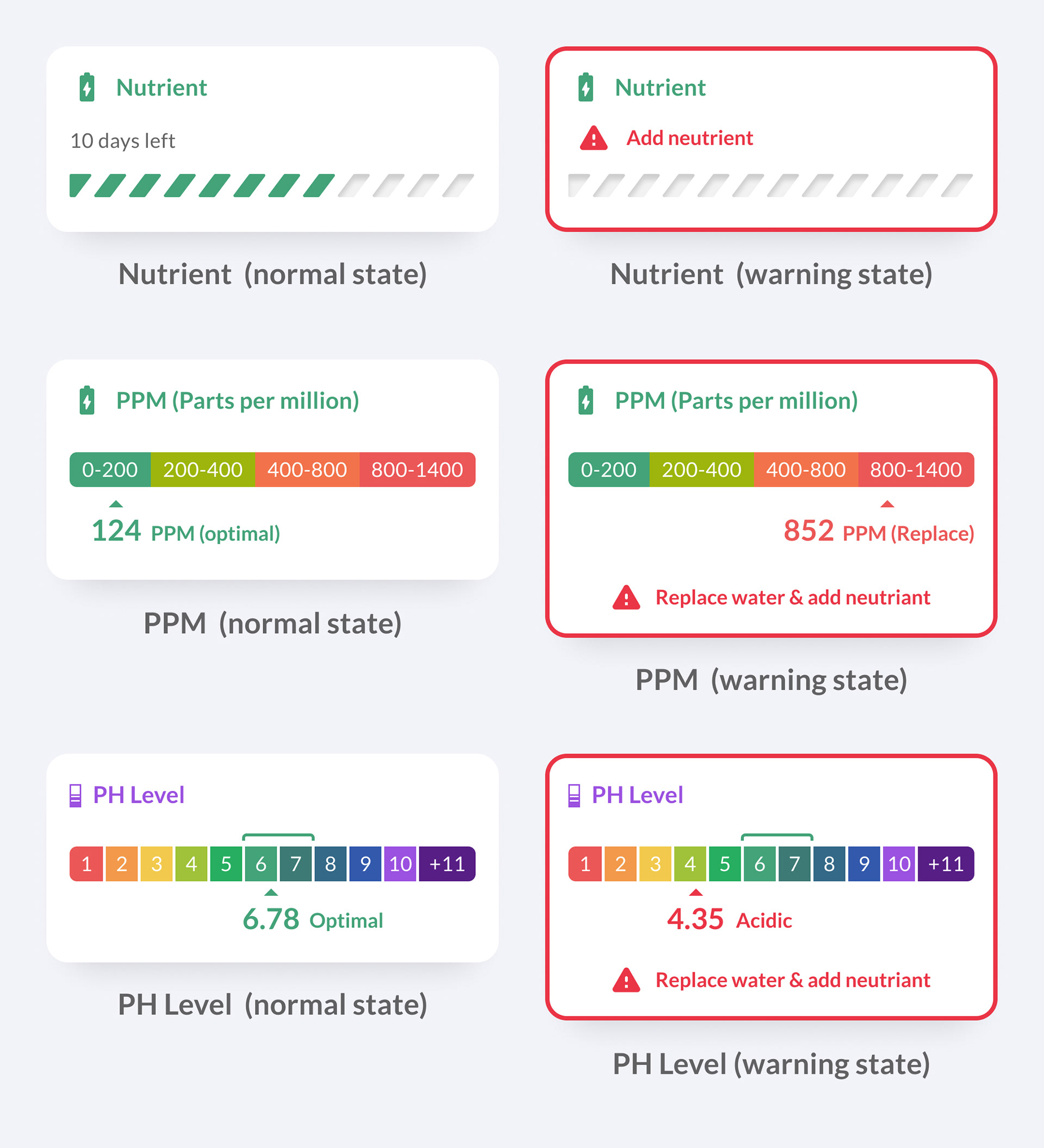
Nutrient / PPM / PH Level cards
If a user has not added any water quality sensors on the hardware, the nutrient card will display as default. The nutrient card is designed to display how many days are left until the user needs to re-administer nutrients. When a user needs to re-administer the nutrient, the card turns to warning state to alert the user. This feature was benchmarked from Aerogarden.
If a user installs a "PPM (Parts per million)" or a "pH Level" sensor on the hardware, a PPM or PH Level card replaces a nutrient card. Added sensors will constantly check the water's status and visualize gathered data on PPM or pH card. If a sensor detects an anomaly, the card turns into a warning state and moves to the top.
Dashboard (info & setting)
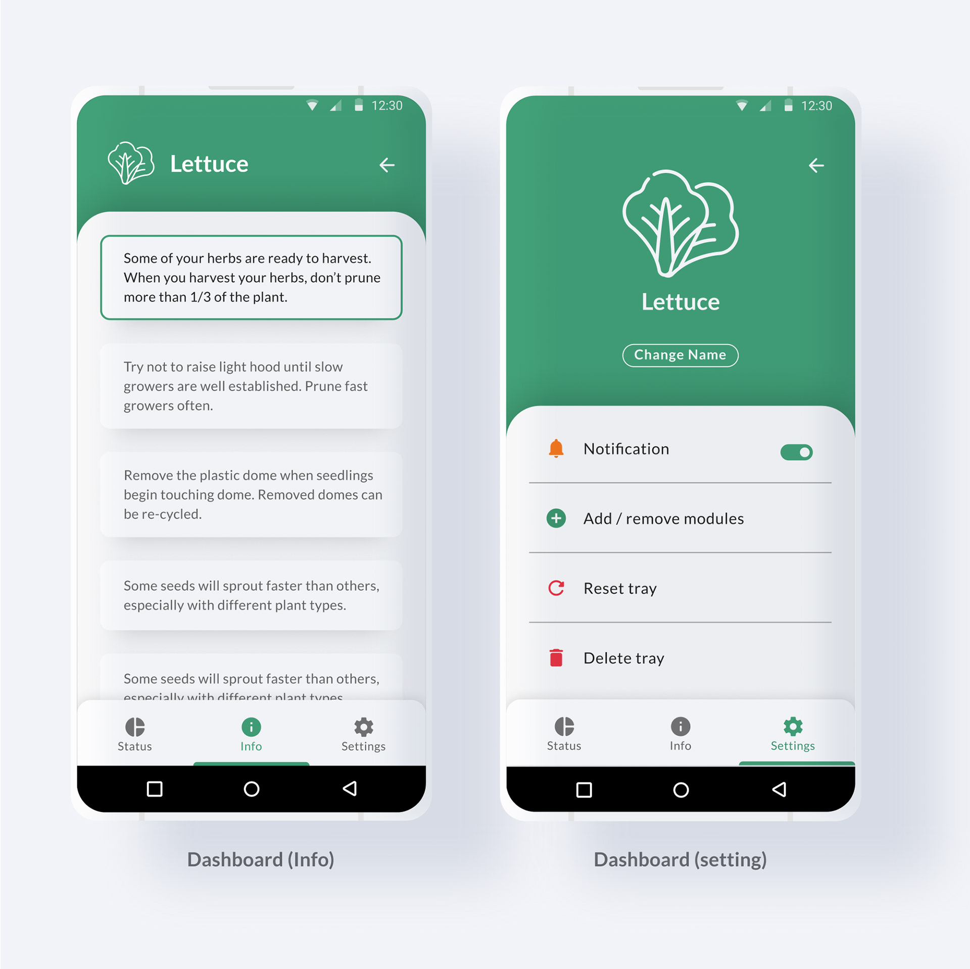
Aerogarden sends gardening tips to users as plants grow. But to view dismissed gardening tips, the user had to go to the settings page, tap tips, then select plant type then look for the tip they dismissed. So I added the "info" tab on the dashboard. "info" tab acts as a notification hub of each device and stores all previously received gardening tips.
The settings tab was added to allow users to customize devices settings such as notification, adding modules, and resetting or deleting the tray.
General Settings
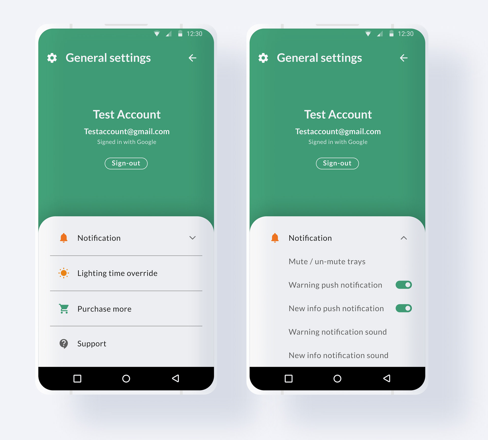
General settings page
Despite half of Aerogarden users own more than one device, there was no feature that allows users to change multiple device's settings at once (i.e. changing "lighting on" time of all devices), Which lead me to come up with the general settings feature. Unlike the settings tab on the dashboard page, the general settings allow users to change notification and lighting time settings of multiple devices at once.
The general settings page also contains a sign-out button, link to customer service, and link to the store page.
Notification setting
Allows users to mute or un-mute selected device's notification.
Lighting time override
Allows users to override selected devices' lighting on/off time.
Press and hold to select
During the user test, I asked the question "how will you change the lighting on-time of all devices to 8 AM at once?" Four testers opened general settings, but one tester said he would press and hold one of the device cards on the home screen, select all devices, then change the selected device's time (similar to selecting multiple images on Android's "galleries" app). This was an unexpected response yet a useful finding.
So I added a feature that allows users to press and hold a device card to select multiple devices and mute/unmute notifications or override the lighting time of selected devices at the home screen.
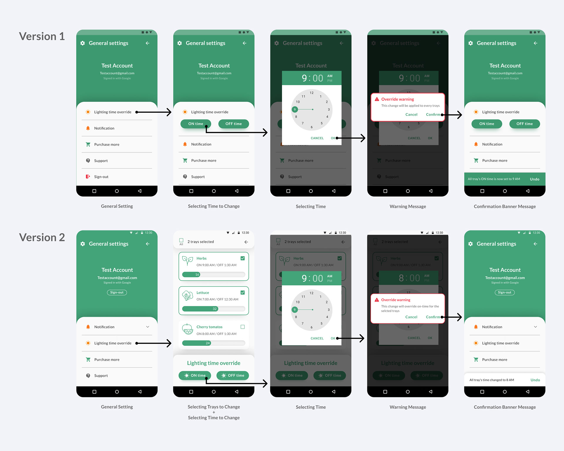
General settings after user test
On version 1 I designed a system to make changes on all devices if a user makes a change in general settings. On version 2 I added a step where a user can select only the devices they would like to make a change. This additional feature was not based on findings from testing but it was added because it was a logical step to take to further improve the user experience of the app.
Measuring Success
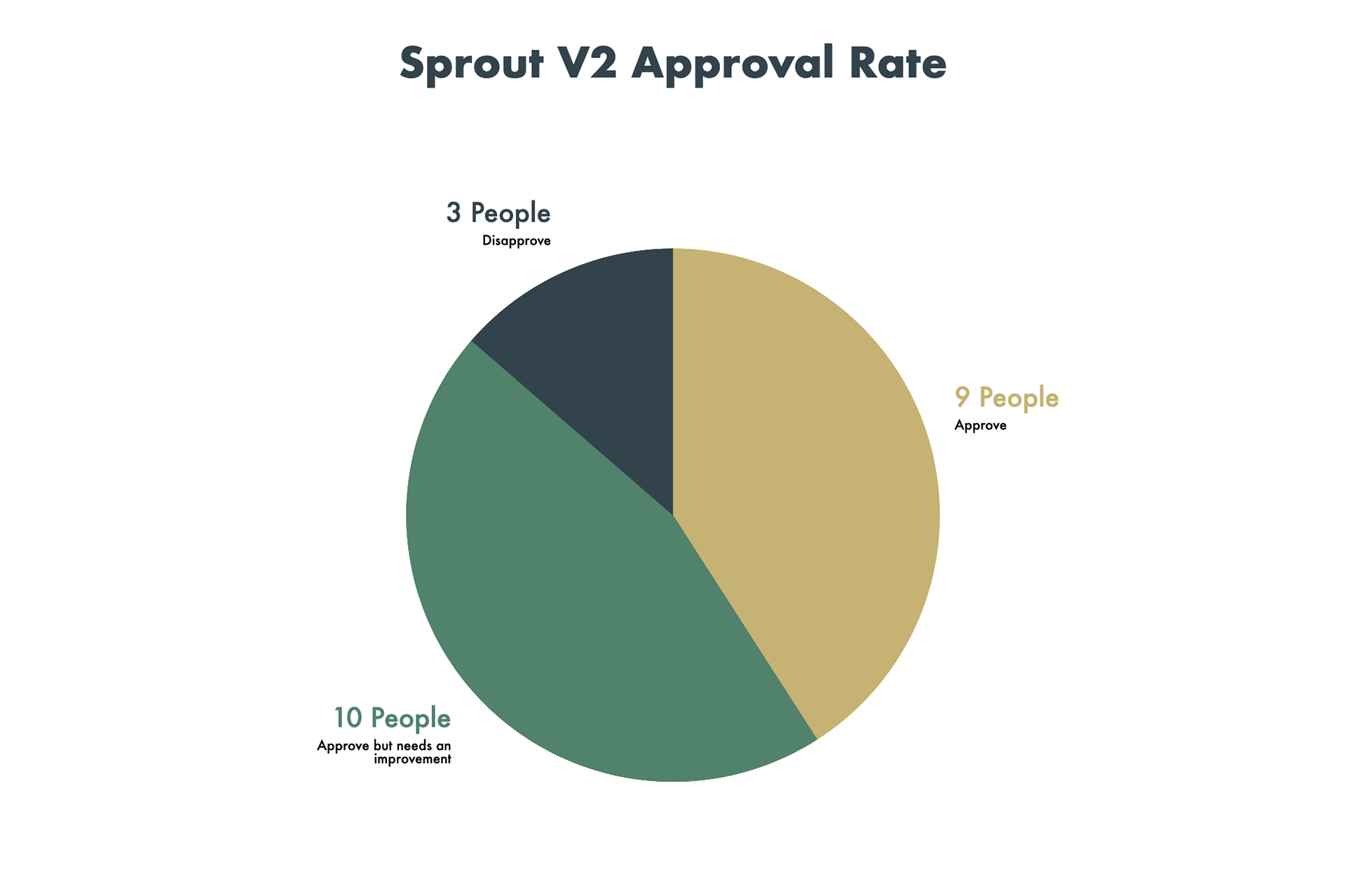
Since sprout was not a real product but a concept project, I was unable to measure how well product will perform in the market. So, after finishing the version 2, I posted designs on multiple indoor farming subreddits to get the feedback from the online community. 86% of Redditors approved sprout's app, and more than half of that 86% gave feedback on how to improve the app further.
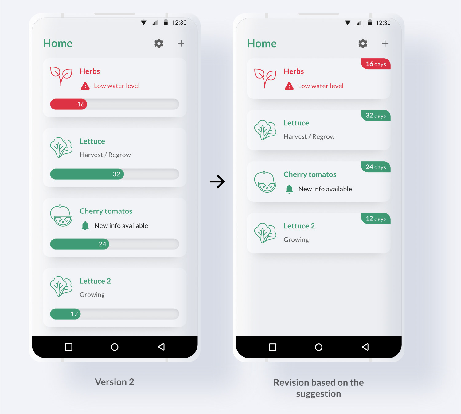
Home screen progress bar
3 Redditors pointed out that the meaning of progress bars at the home screen didn't come off clearly. Another Redditor pointed out that, plants such as lettuce and herbs regrow after harvest and there is no real point of displaying how long plants have been growing as a progress bar.
Initially, I employed a progress bar to represent how long the plant has been growing by benchmarking Aerogarden. I assumed Aerogarden had a progress bar to visualize days until harvest. But the harvest was around day 30 (1/3 of the progress bar), and when progress bar filled up around day 80, Aerogarden just suggested to buy new seed kit and start over. When I found this out, it was after finish designing version 2's home screen.
So based on the feedback and later findings, I removed progress bars from the home screen and replaced them with tags that show how long plants have been growing.
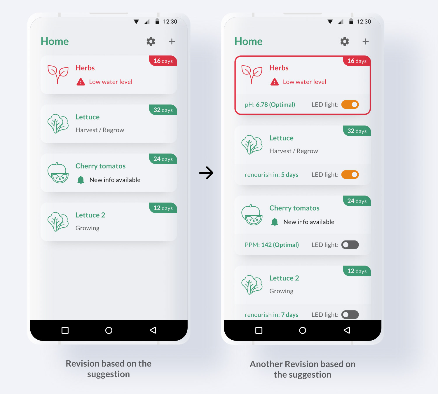
Showing more info on the Home screen
Another feedback that I received was a request to show more information on the home screen. Since the progress bar was removed, I used that room to show more basic information. So I added a basic water quality information and LED light control toggle button on device cards.
It will require quantitative feedback to evaluate if this leads to information overload or improving user experience.
Other feedbacks
• A feature that allows users to manually log growth record by taking pictures and writing down notes
• Previous data and trends visualized as graphs
• App should suggest which add-on modules user should purchase base on their behavior (i.e. if a user fails to re-fill water often, then it should suggest external watering system add-on)
• App should suggest how to preserve or recipe for overproduce (a common problem when growing herbs)
• Water temperature thermostat module
Disapprovals
• Hardware price going up as purchasing more modules was the most common concern
• Some perceived selling additional module as unethical business practices, similar to videogame DLC
• Some disliked a fact they need an app to manage their plants
Conclusion & Takeaways
The biggest lesson I learned throughout the project was learning how to collaborate with an industrial designer to design a software interface that can accommodate hardware's unique characteristics.
Another lesson I learned was that I shouldn't blindly benchmark foundational features of other products. I used progress bars to visualize how long plants have been growing just because Aerogarden did so, but by the end of the project, I learned it was just Aerogarden's bad design decision with no reasoning behind.
Measuring success based on the online community's feedback also taught me how to utilize an agile approach to quickly improve the product after launching MVP by adopting users' feedback.
I was very lucky to collaborate with a talented industrial designer Heyward Smith and receive helpful feedback from Auburn University's horticulture department and Reddit's indoor farming community. I would like to thank everyone who helped me throughout this project.
Award
Auburn University GDES Student Show 2020 | First Place in Interactive Section
Illustration resource: "Icon made by Freepik from www.flaticon.com"